This work is protected.
Enter the password to view this work. If you don't have it, message me.
The Problem
Pipekit had a successful, fully-featured web-based application that was providing value for customers and driving both net-new and expansion revenue. However, customers could only try Pipekit via a custom, sales-driven demo environment.
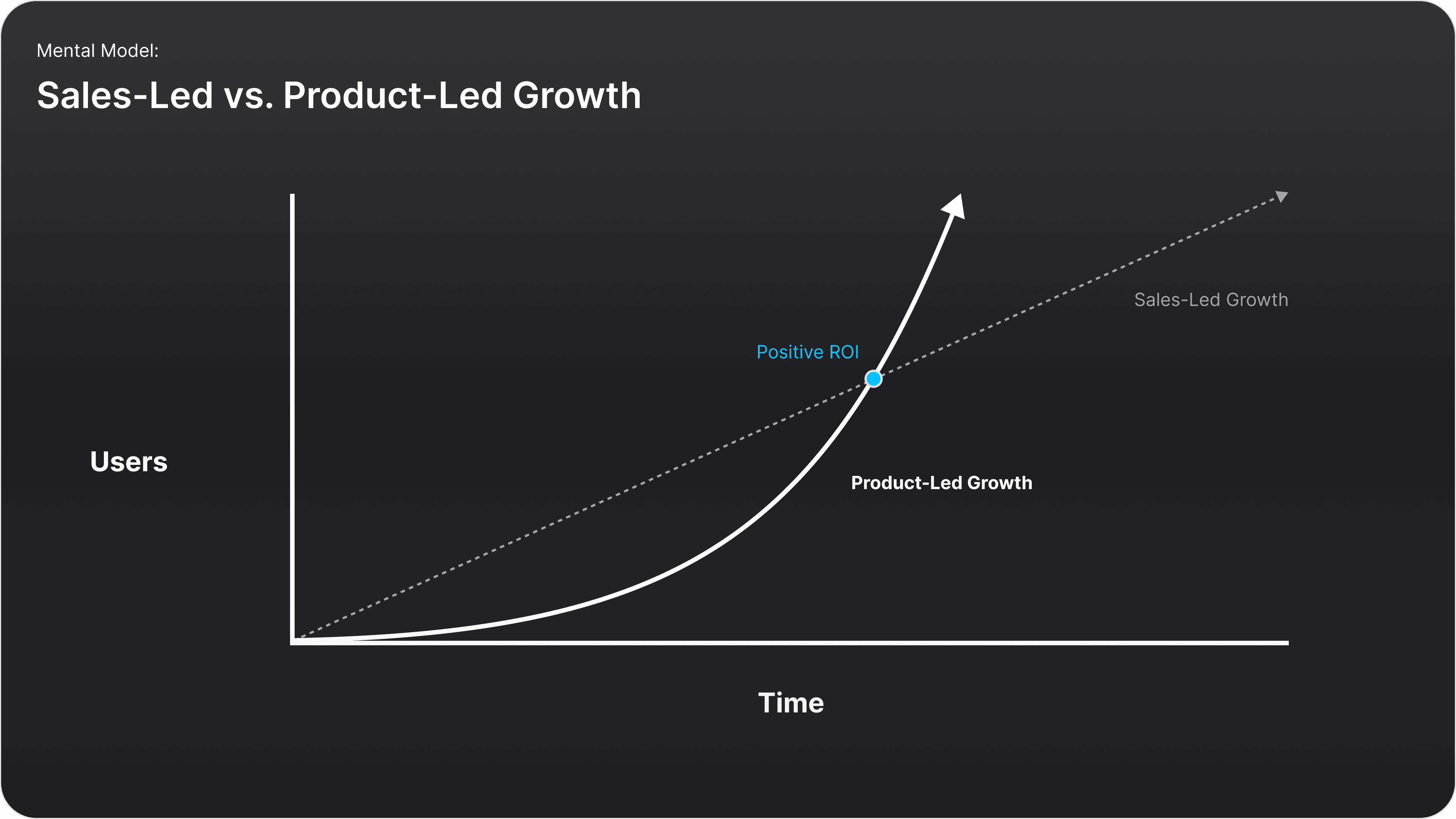
We wanted to change this motion entirely and develop a product-led growth strategy: one where organic traffic could be captured and converted into sales leads and new customers via a publicly-available, high-value new product offering.
The Final Solution (Sneak Preview)
To facilitate this product-led growth motion, I designed and launched an all-new observability feature for the Pipekit platform - one that only required a few seconds of setup for an all-new user. This feature - which we referred to as “Workflow Metrics” - was the first and only observability plane on the market made for Argo Workflows.
Workflow Metrics was launched in mid-2024 and is hard at work offering value to end users and capturing leads for Pipekit’s growth team.

Context Setting
What is Kubernetes?
Kubernetes is a container orchestration platform that automates the deployment, scaling, and management of containerized applications. It provides a foundation for building and managing cloud-native applications, ensuring high availability and efficient resource utilization.
Analogy: Kubernetes is like a city's infrastructure: it provides the roads, power grid, and water supply for buildings to operate. It manages the underlying resources (compute, storage, network) and ensures applications (the buildings) can run smoothly.


Context Setting
What is Argo Workflows?
Argo Workflows is a workflow engine built on top of Kubernetes that allows for the orchestration of parallel jobs. It's useful for tasks like data processing, machine learning, and CI/CD pipelines.
Analogy: Argo Workflows is like a city planner. It leverages the city's infrastructure (Kubernetes) to coordinate the various tasks involved in building or maintaining infrastructure. It breaks down big projects into smaller steps (workflows), assigns different teams (containers) to each step, and ensures everything happens in the right order.
Context Setting
What is Observability?
Observability is the ability to understand the state of a system by using telemetry data to gain insights into system performance, behavior, and errors.
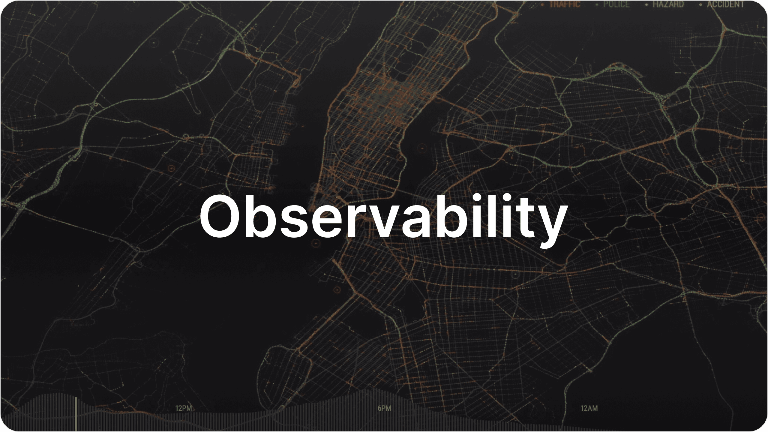
Analogy: Observability is like a city's traffic management system. Using data is collects from sensors, cameras, and other sources, city planners can make informed decisions about infrastructure improvements and emergency response.
The Product Opportunity
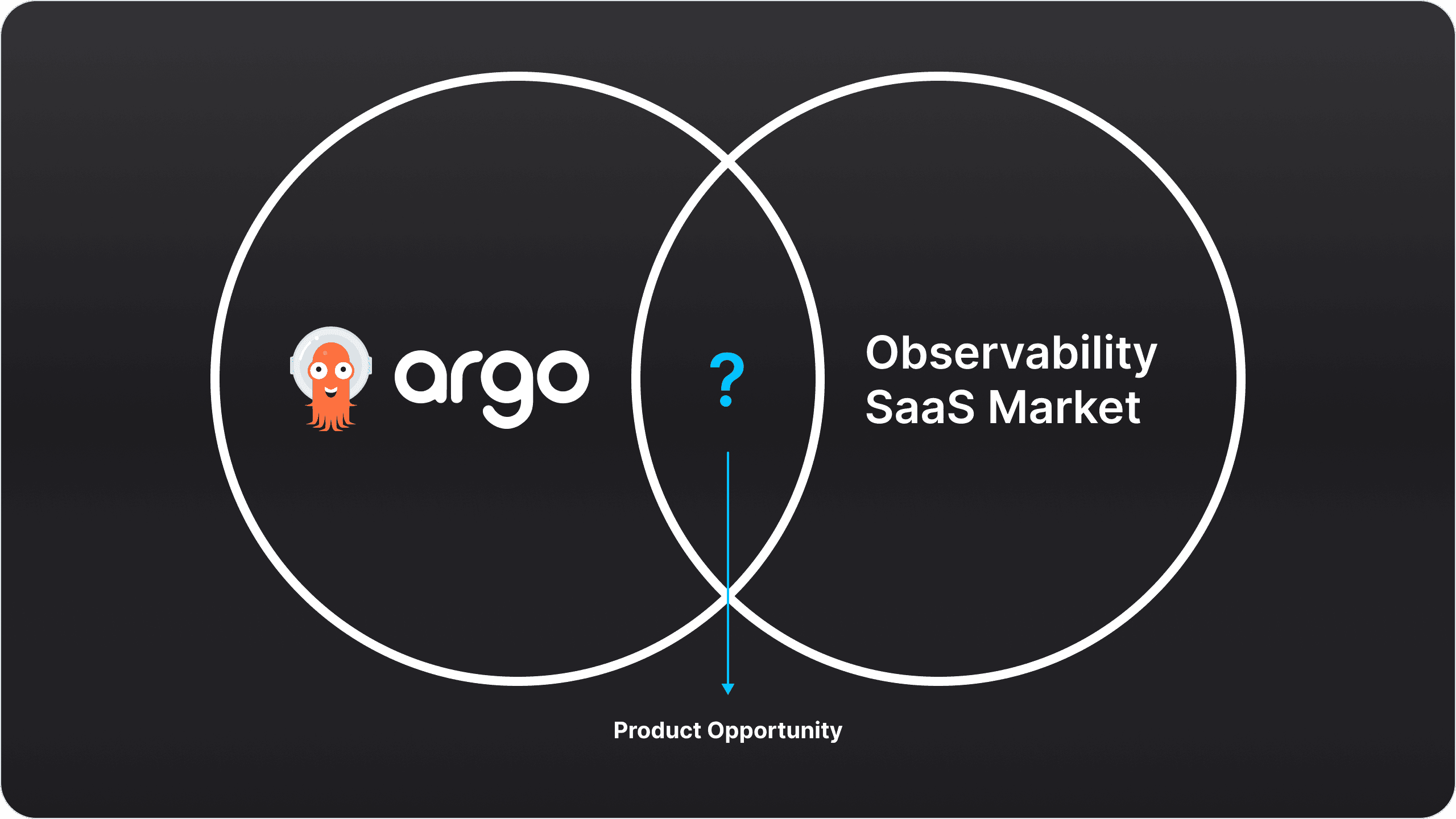
Now for the product opportunity. We knew we needed a high-value, low-barrier-to-entry new feature to help entice people to try Pipekit themselves, and ultimately landed on an observability plane for Argo Workflows.
We felt this was a strong direction because there wasn’t any such product or feature on the market - meaning that, by bringing this to market, we would have the opportunity to be the first and only observability offering on the market tailor-made for Argo Workflows observability.
The Business Opportunity
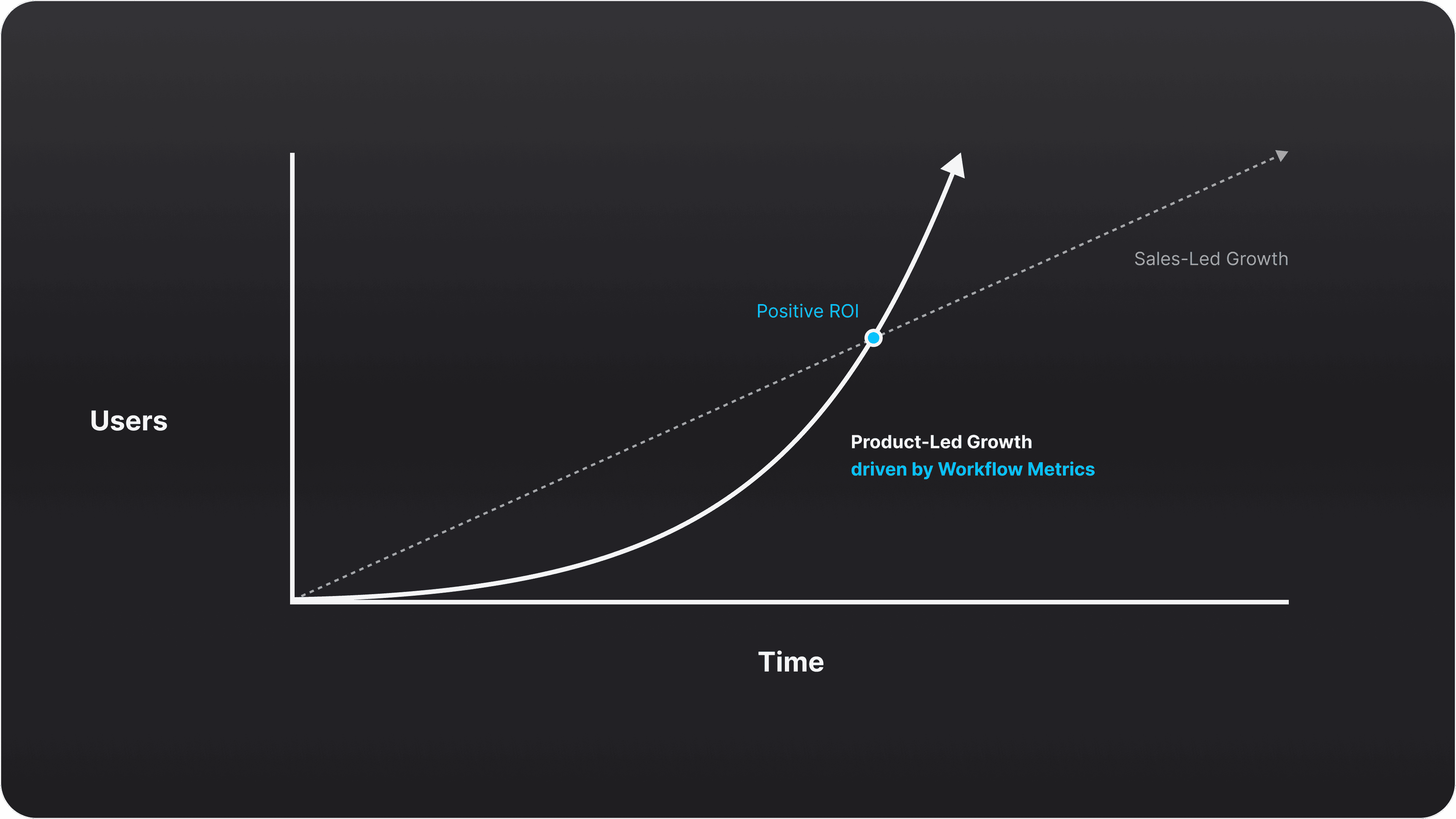
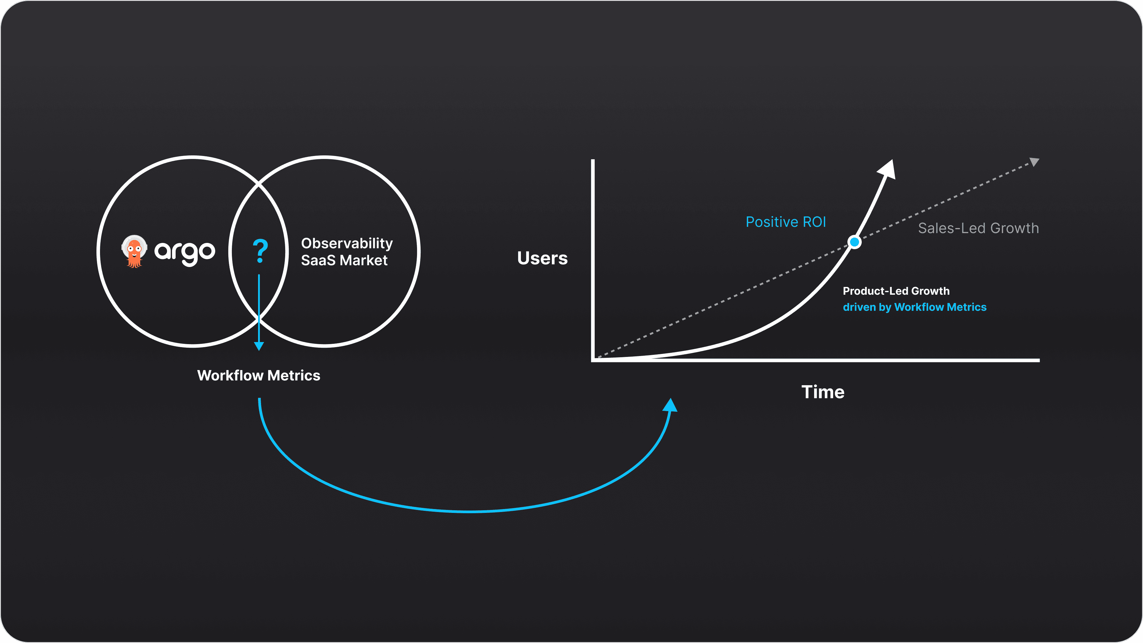
The reason we wanted to bring this new product to market was, of course, to help with business growth. Recalling the earlier note about product-led growth, our hypothesis was that by introducing a free-to-use, easily-accessible observability plane for Argo Workflows to the market, organic interest in this product would help drive new business growth via prospect intros and high-quality leads.
In Sum: The Opportunity
Pipekit had a successful, fully-featured web-based application that was providing value for customers and driving both net-new and expansion revenue. However, customers could only try Pipekit via a custom, sales-driven demo environment.
We wanted to change this motion entirely and develop a product-led growth strategy: one where organic traffic could be captured and converted into sales leads and new customers via a publicly-available, high-value new product offering.
Defining Requirements via UXR
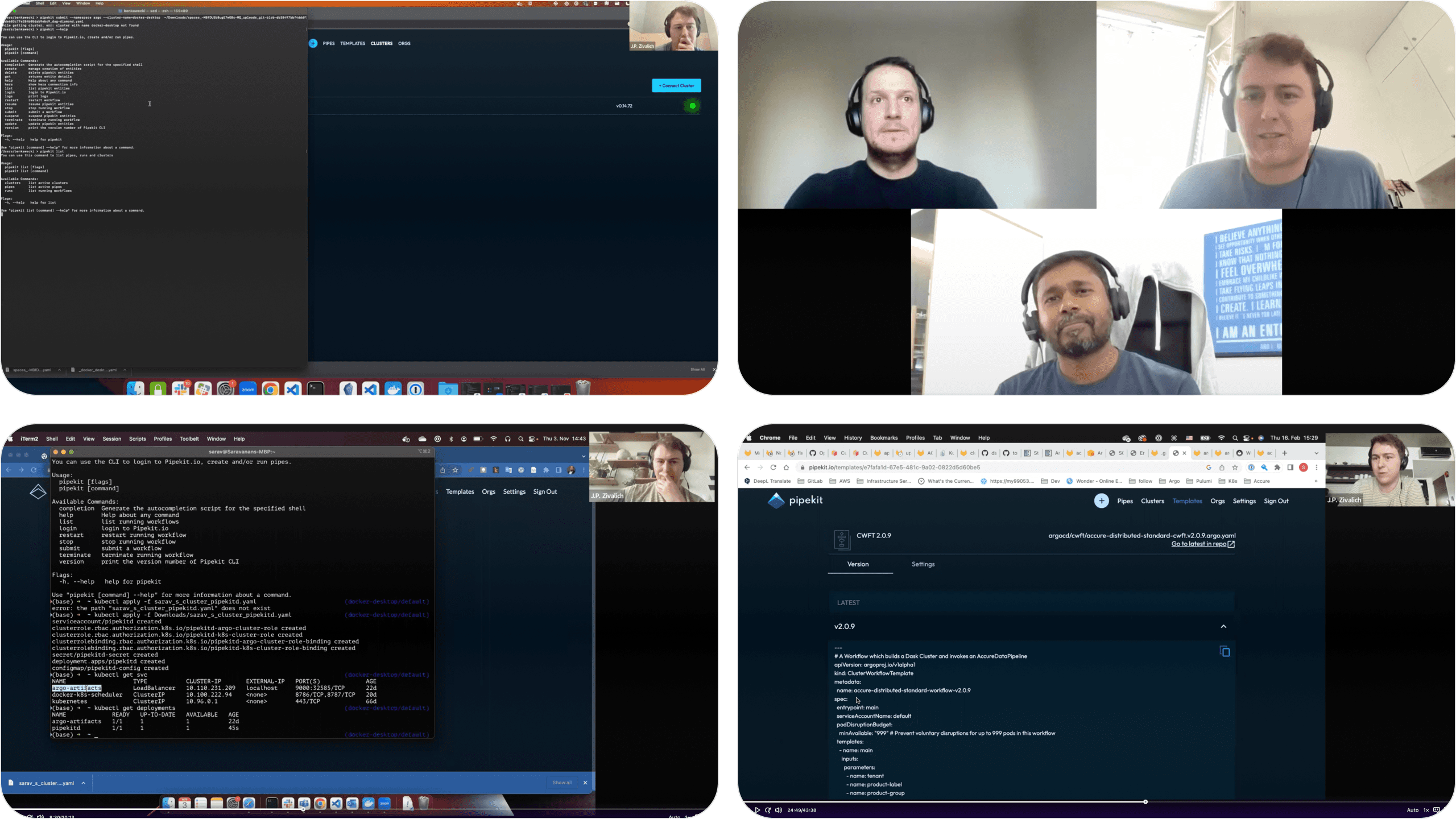
To secure the requirements for this project, our product team ran a research campaign with some of our customers, Argo open source maintainers, and powers users to determine what pains an observability plane could solve for them and what metrics specifically would be most useful to provide visibility for. Through these discussions and research on similar observability platforms, a clear set of requirements emerged.
Design Requirements
Provide ML Engineers and Infrastructure Engineers using Argo Workflows with a high-value, easy to use observability plane through which to track...
Metric Set #1
Argo Workflows
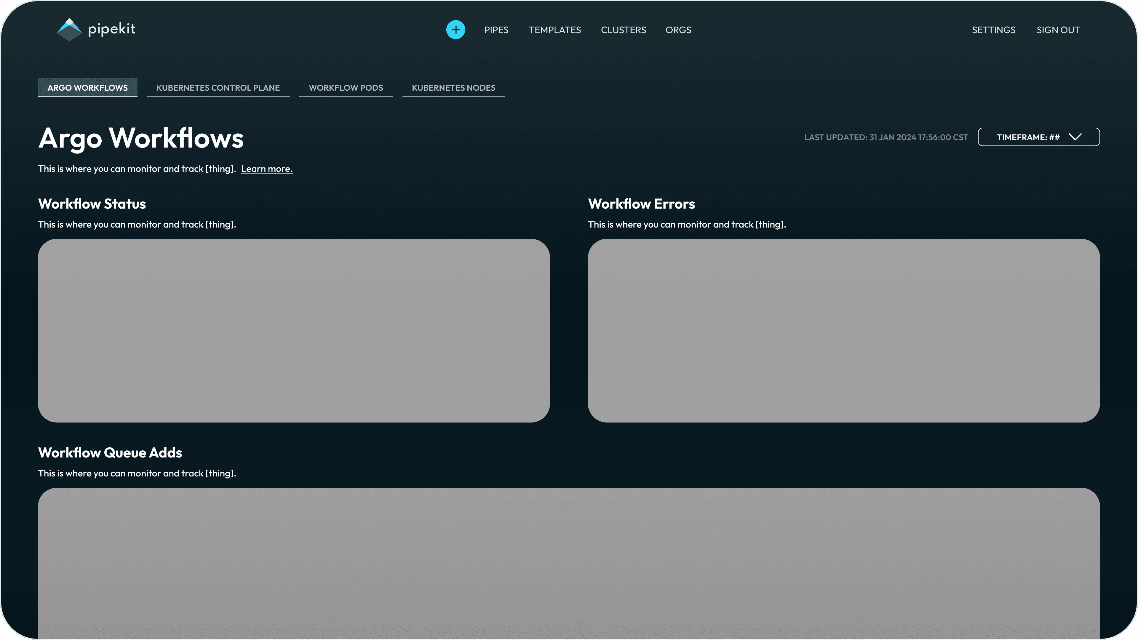
Monitor and track the health and performance of their Argo Workflows by charting…
Workflow Status
Workflow Errors
Workflow Queue Adds
Metric Set #2
k8s Control Plane
Monitor and track how their Workflows are interacting with their k8s cluster by charting…
Work Queue Latency
Work Queue Add Rate
Work Queue Depth
Metric Set #3
Workflow Pods
Monitor and track the creation of Pods managed by Argo Workflows by charting…
Workflow Pods Managed
Metric Set #4
k8s Nodes
Monitor and track the health and performance of your k8s nodes by charting….
Active Node Count
Node CPU Usage
Node Memory Usage
Recall: Design Requirements
Provide ML Engineers and Infrastructure Engineers using Argo Workflows with a high-value, easy to use observability plane through which to track...
Metric Set #1
Argo Workflows
Metric Set #2
k8s Control Plane
Metric Set #3
Workflow Pods
Metric Set #4
k8s Nodes
Iteration #1
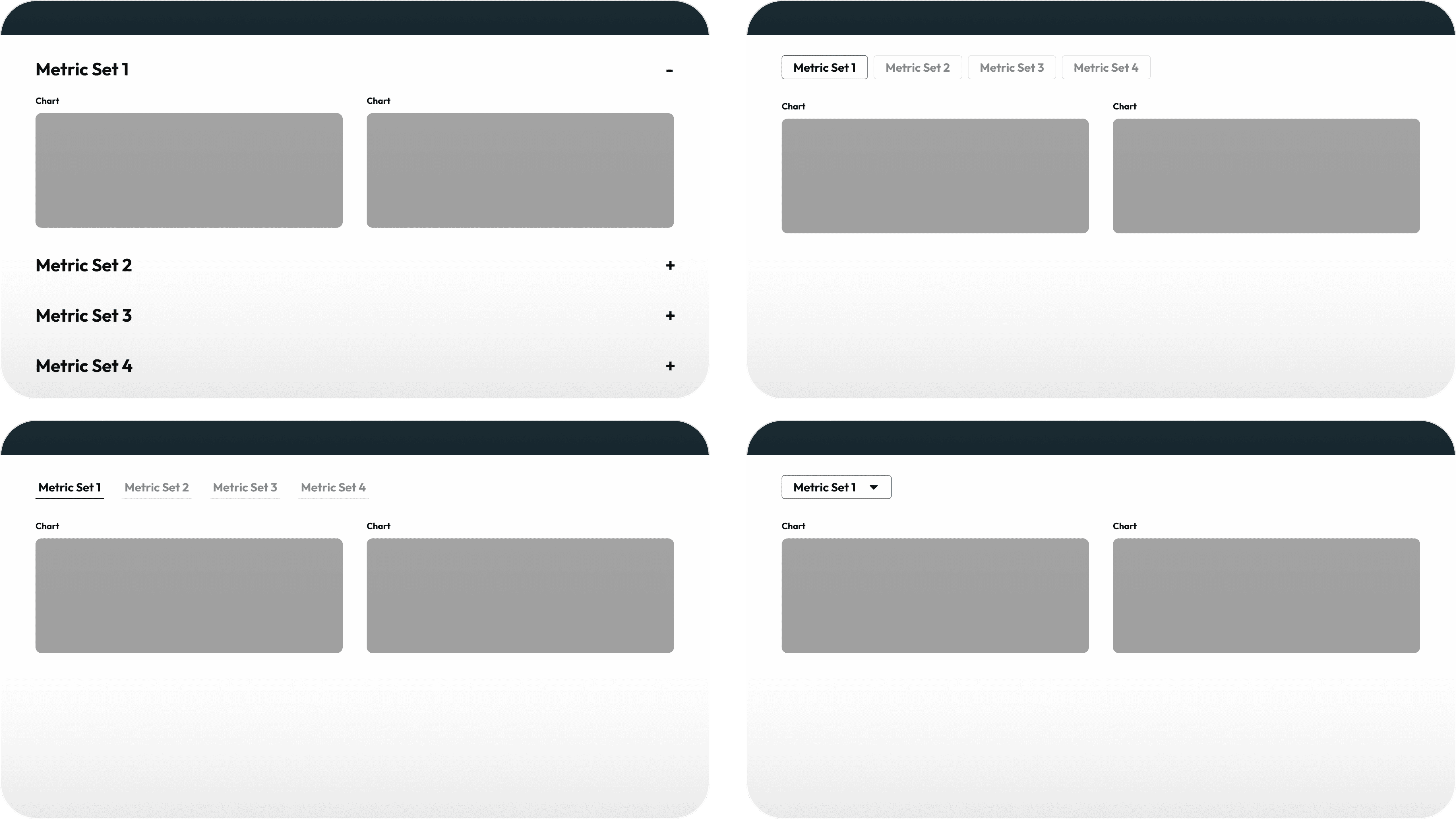
Wireframe → Layout Exploration
Copy here.
Iteration #1
Wireframe → Layout Decisions
Copy here.
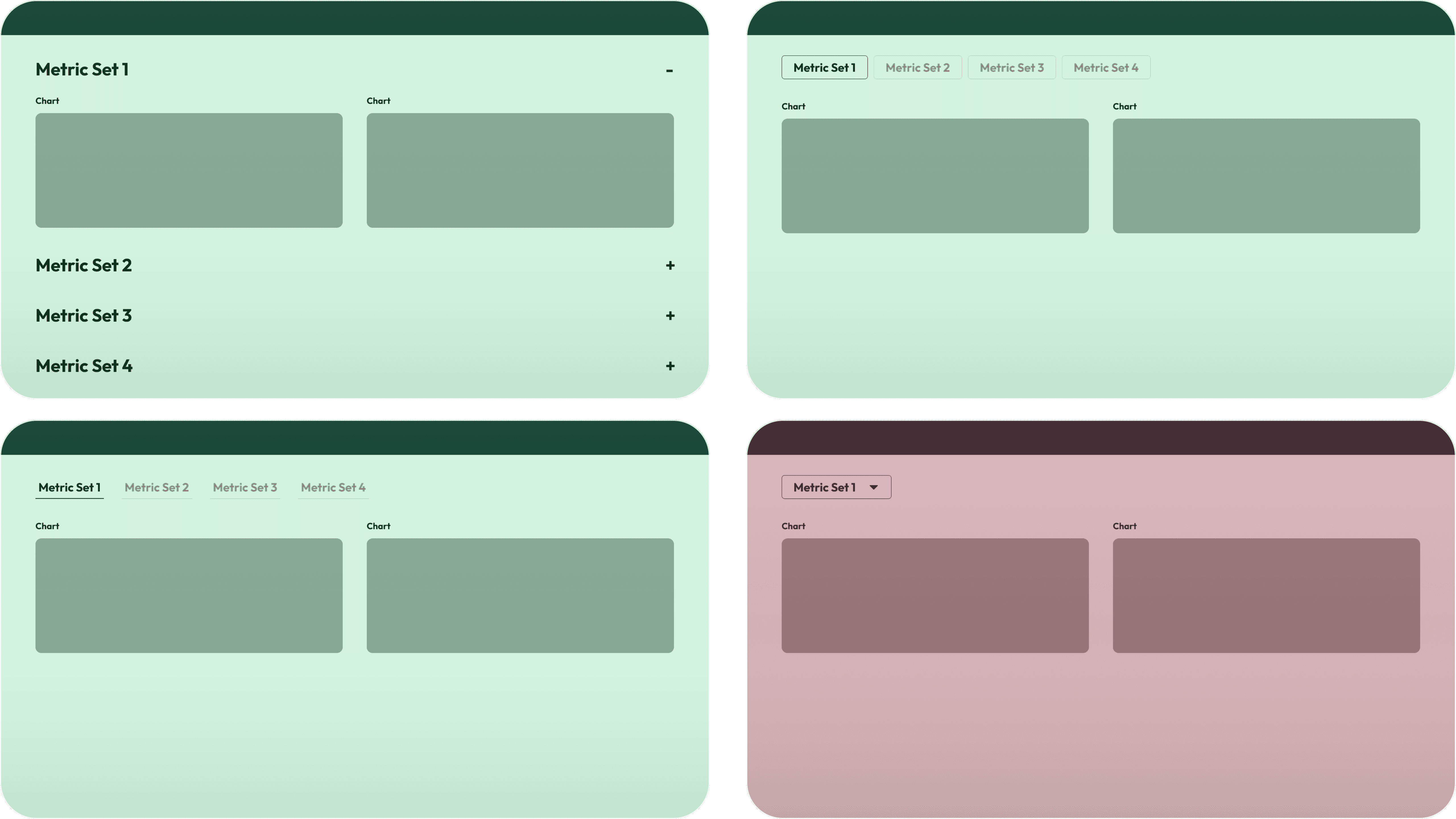
Iteration #2
MedFi → Layout Exploration
Copy here.
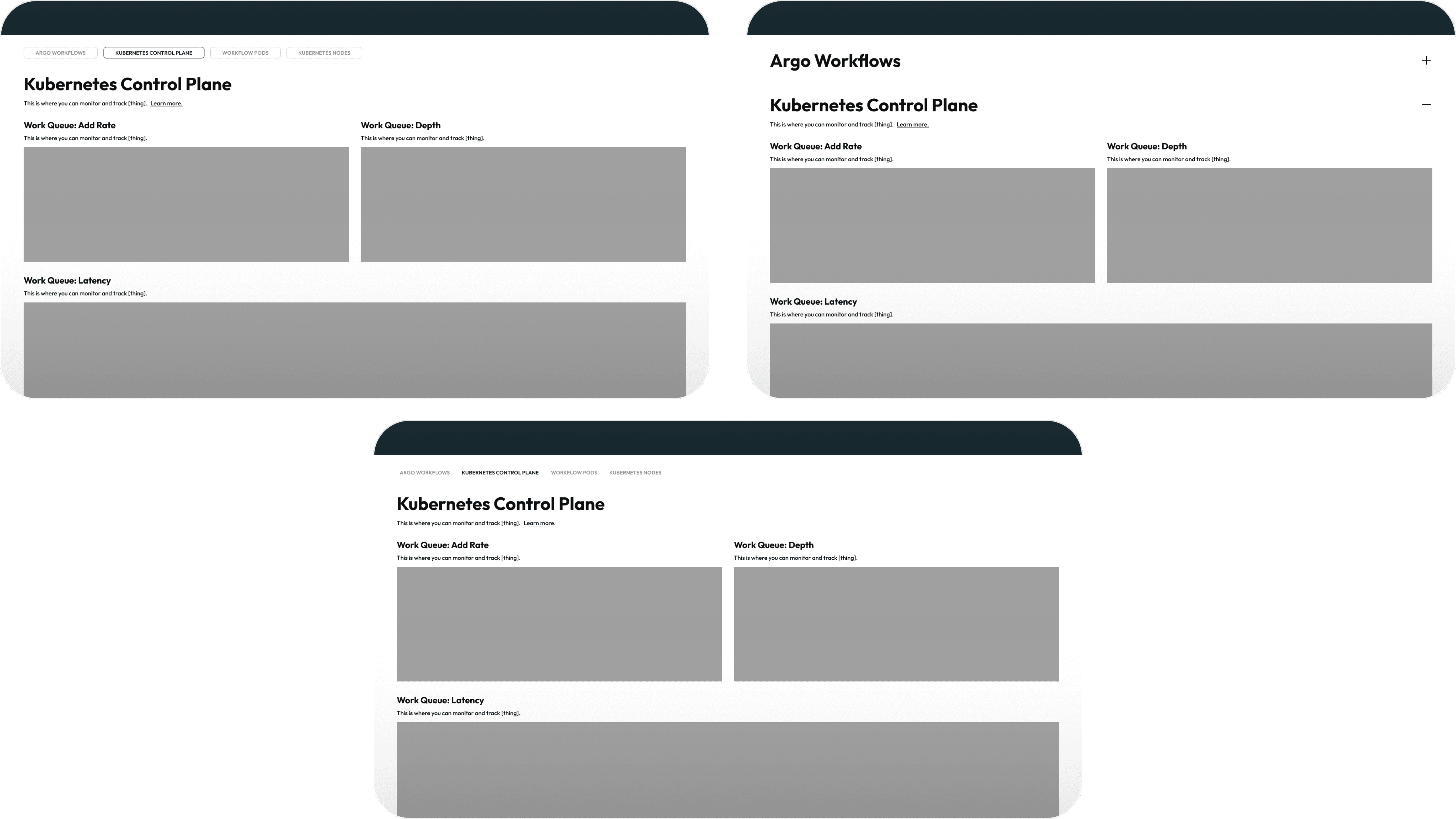
Iteration #2
MedFi → Layout Decisions
Copy here.
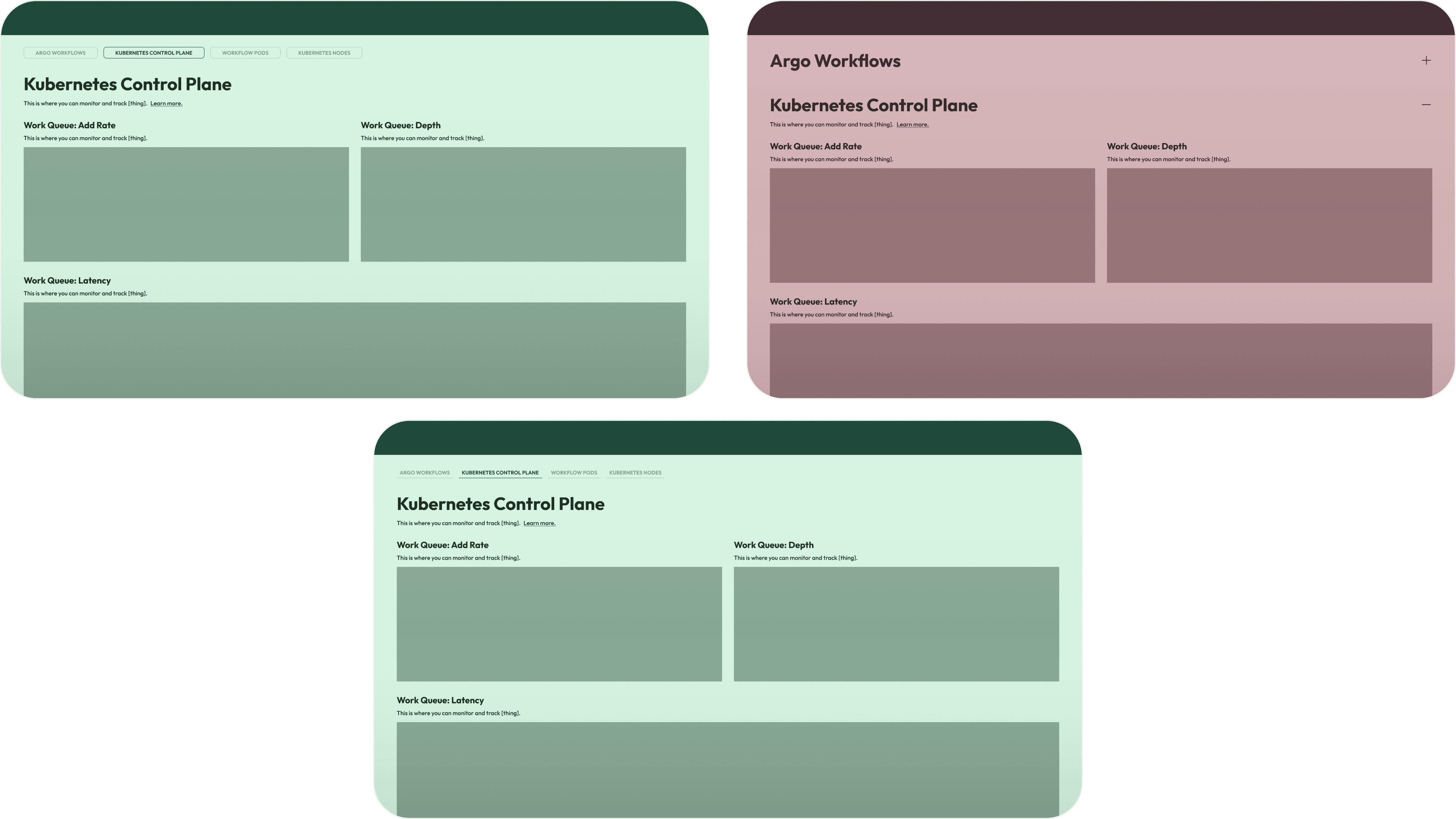
Iteration #3
HiFi → Visual Design Exploration
Copy here.
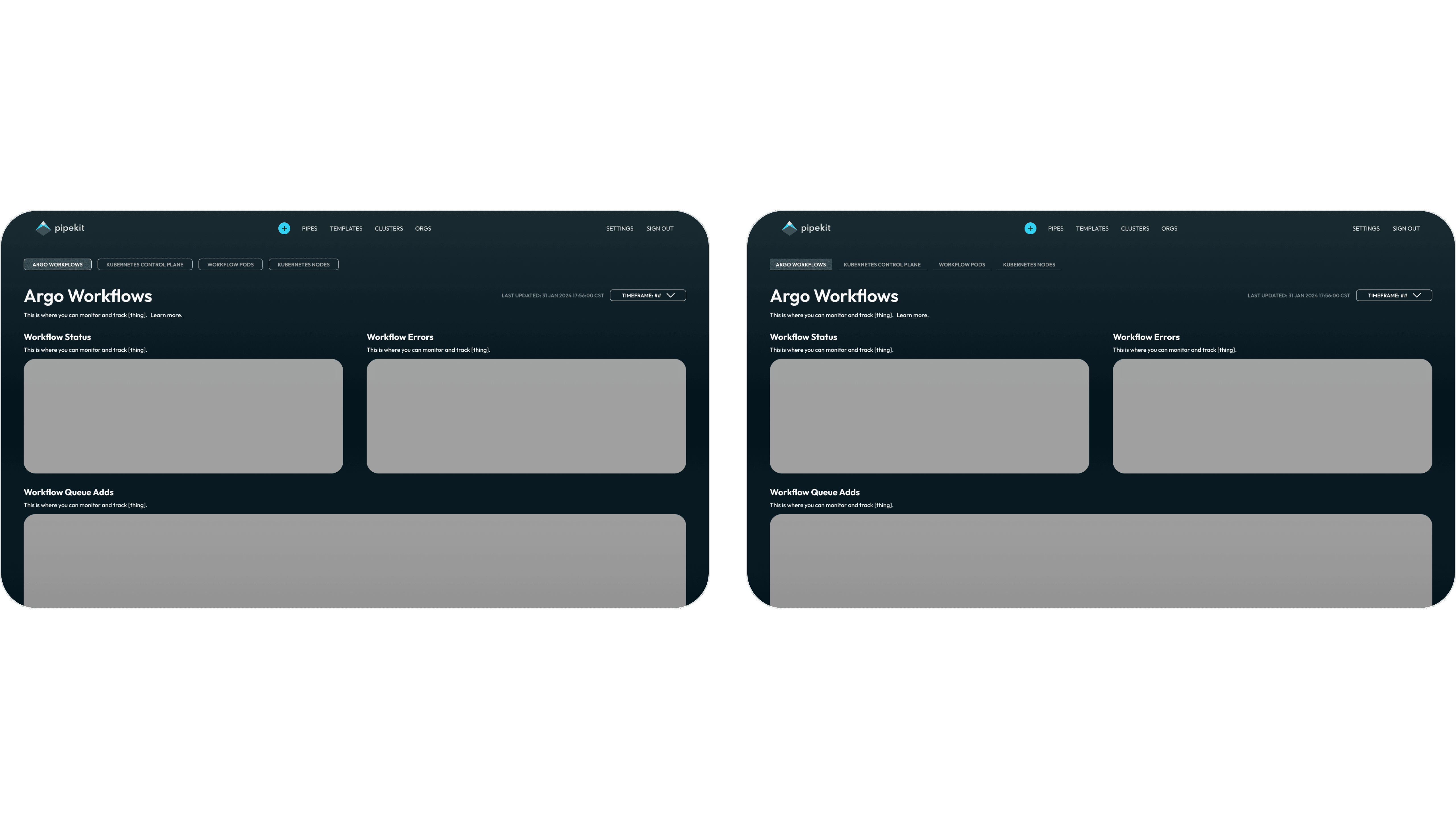
Iteration #3
HiFi → Visual Design Decisions
Copy here.
Result
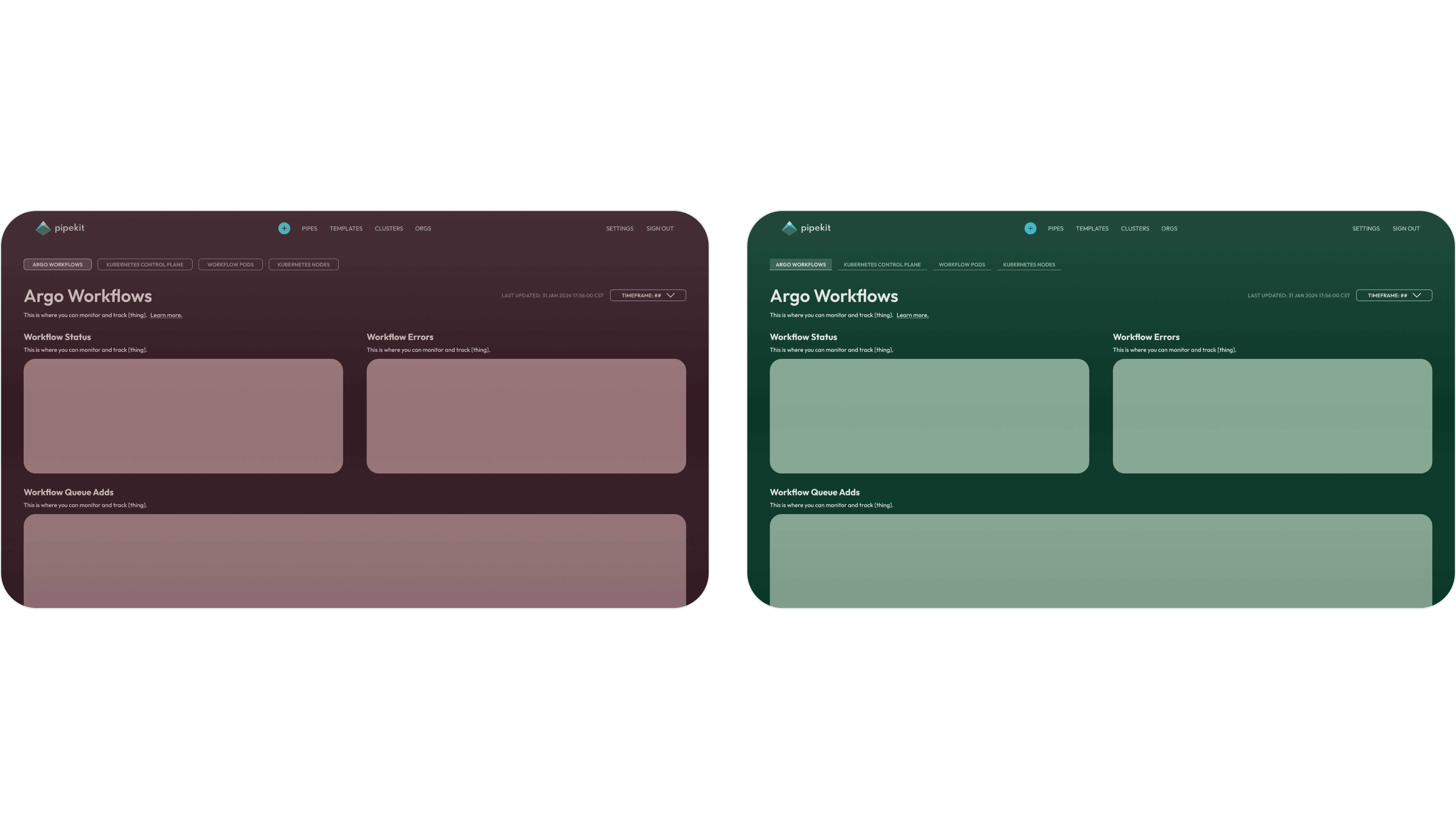
Winning Layout: Tabbed Nav
Copy here.
Building an Architecture
Before designing and future-state UIs, the first task at hand was to define a standard, consistent architecture for the Buying Indicators from which new platform capabilities could be unlocked, and upon which the future-state designs of the affected features could pull new capability. This architecture was the very first attempt in the history of the company to actually standardize how we construct Buying Indicators, standardize how we (and our users) understand Buying Indicators, and envision how we might create a better and more scalable structure for the future of the platform.
Understanding Buying Indicators
Example Indicator Matrix
To begin to build this new architecture, the first thing I did was breakdown and assess how Buying Indicators are being used currently. Recall that the greatest pain mentioned by our users was that it was unclear how the Buying Indicators should be used - but through many conversations, patterns emerged, and converged around our three core workflows from above - Account Prioritization, Account Planning & Messaging Planning, and Contact Sourcing. To the right, I mapped out one of our largest customer’s Buying Indicators to this novel structure, to see if there was some alignment there.
Mapping the Use Cases of a Buying Indicator
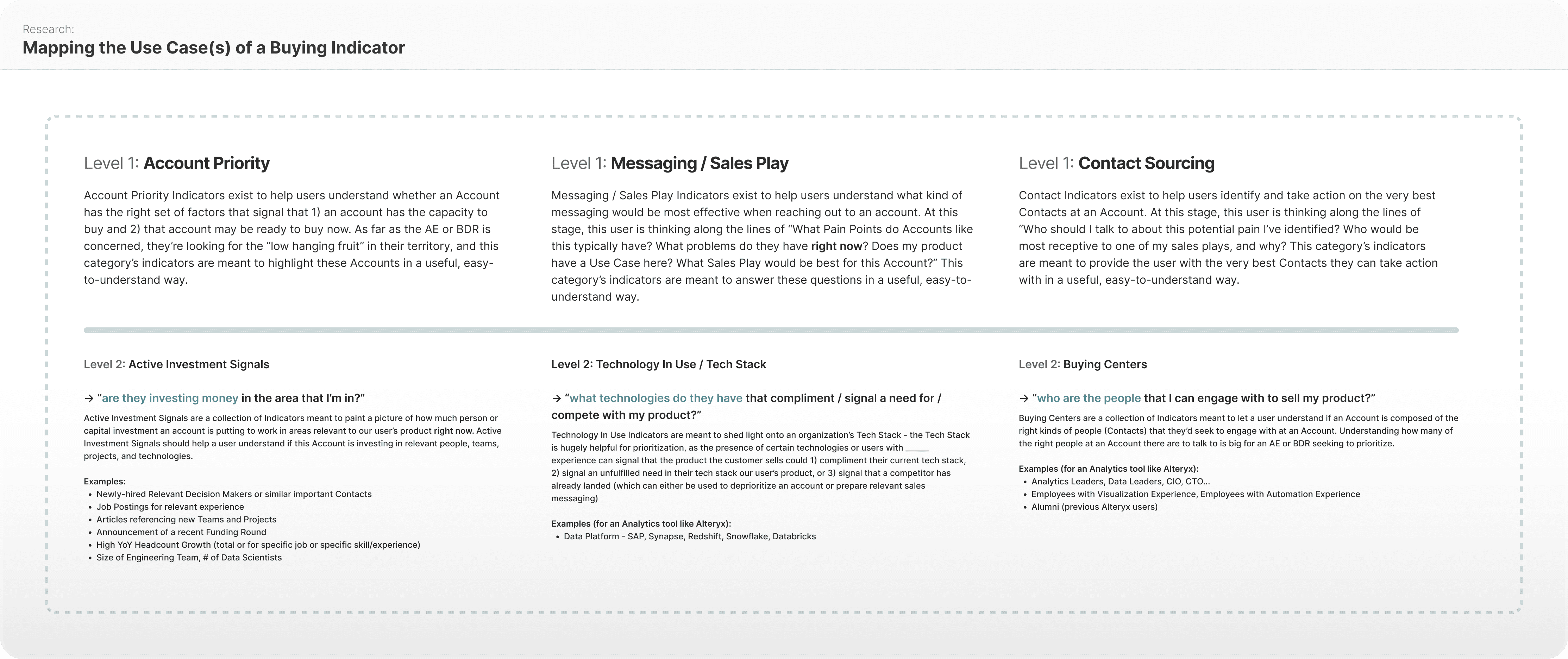
After confirming that there was definitely “something there” with the new use case structure, I mapped out the second level underneath primary Use Case - a new means through which to group Buying Indicators together, visually - creating the categories of Active Investment Signals, Tech Stack, and Buying Centers.
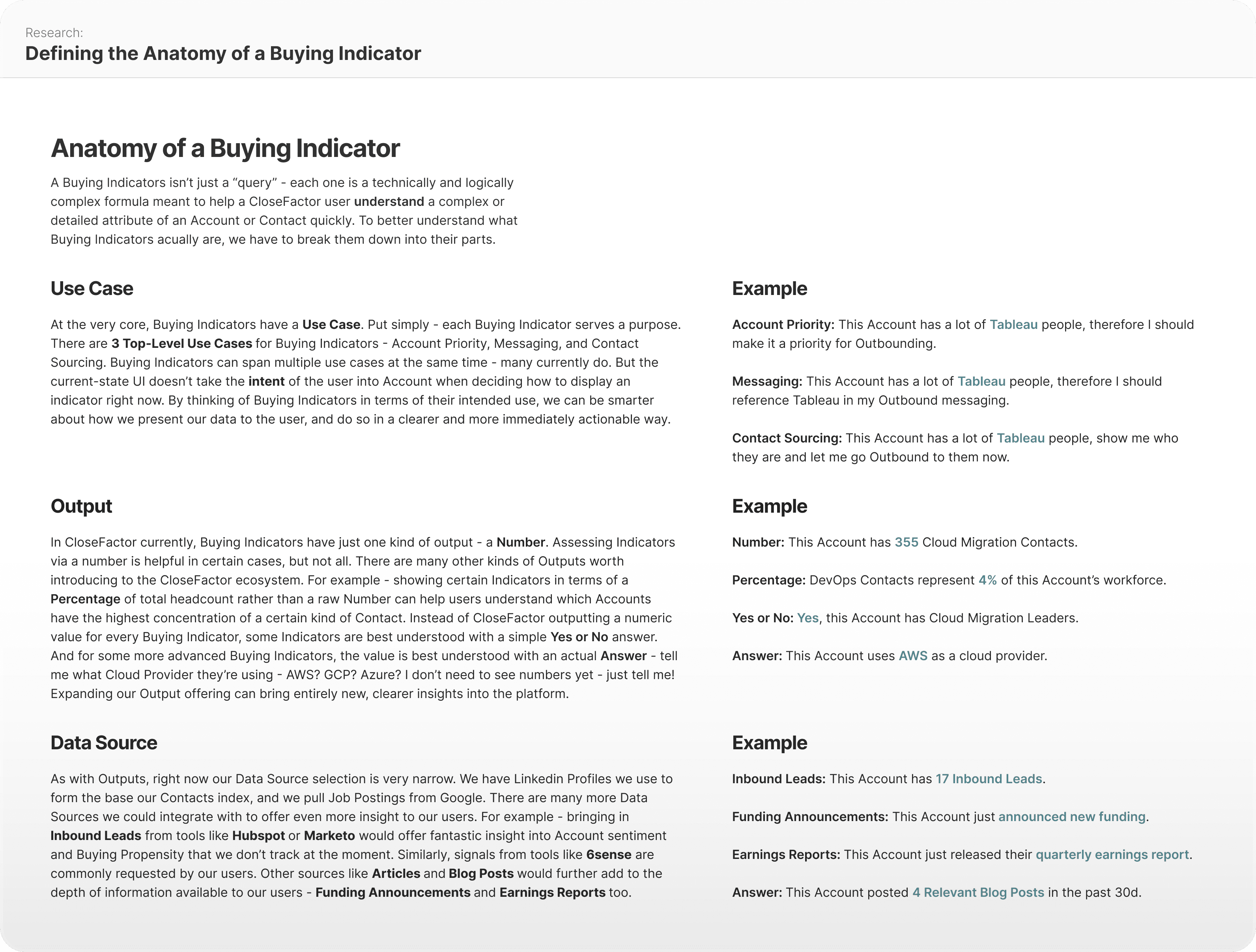
Defining the Anatomy of a Buying Indicator
After running the above concept by my team and getting it in front of our users (and getting positive responses from both parties), I took the time to more formally define an architecture for the Buying Indicators. The big insight here was breaking down Buying Indicators into three “parts”, which could be mixed and match to create custom (but predictable) constructions - Use Case, Output, and Data Source.
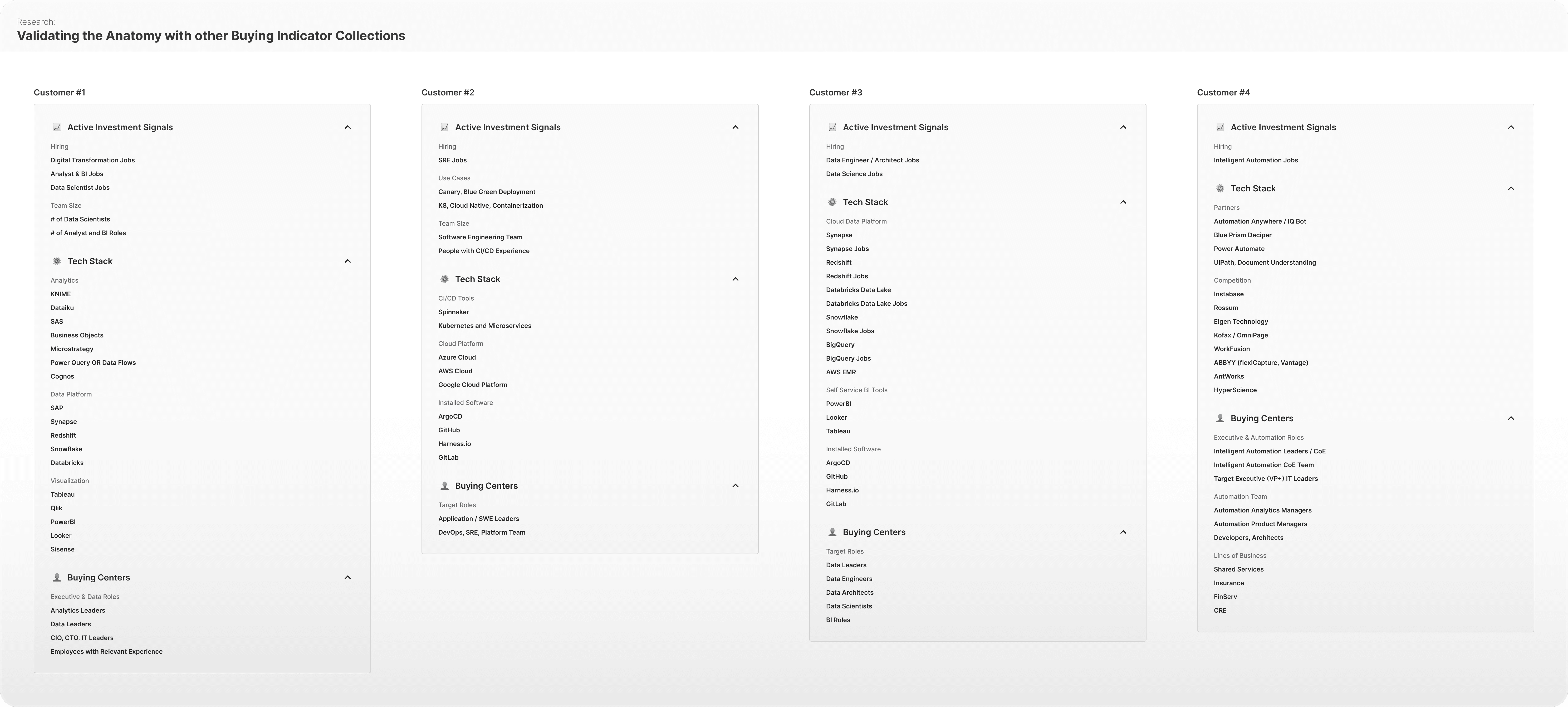
Validating the Anatomy with other Buying Indicator Collections
One final check before confirming the new structure and baking the new capabilities into the future state designs was to make sure that the new architecture would work with other customers’ Buying Indicator collections. I took the new architecture and checked it against other collections - and the new structure held up strong, and every Buying Indicator had a corresponding section. This confirmed that the new structure was sound.
Account Prioritization Workflow
Whether we're looking at an AE with a dozen Accounts or a BDR with hundreds, which Accounts they choose to spend time on can quite literally make or break their quarter (as in - make or break whether they get a big bonus, make president's club, even keep their job in some cases). When looking at their territory, they want to make sure that whatever activity they do is spent focused on the Accounts most likely to actually yield real opportunities and real revenue.
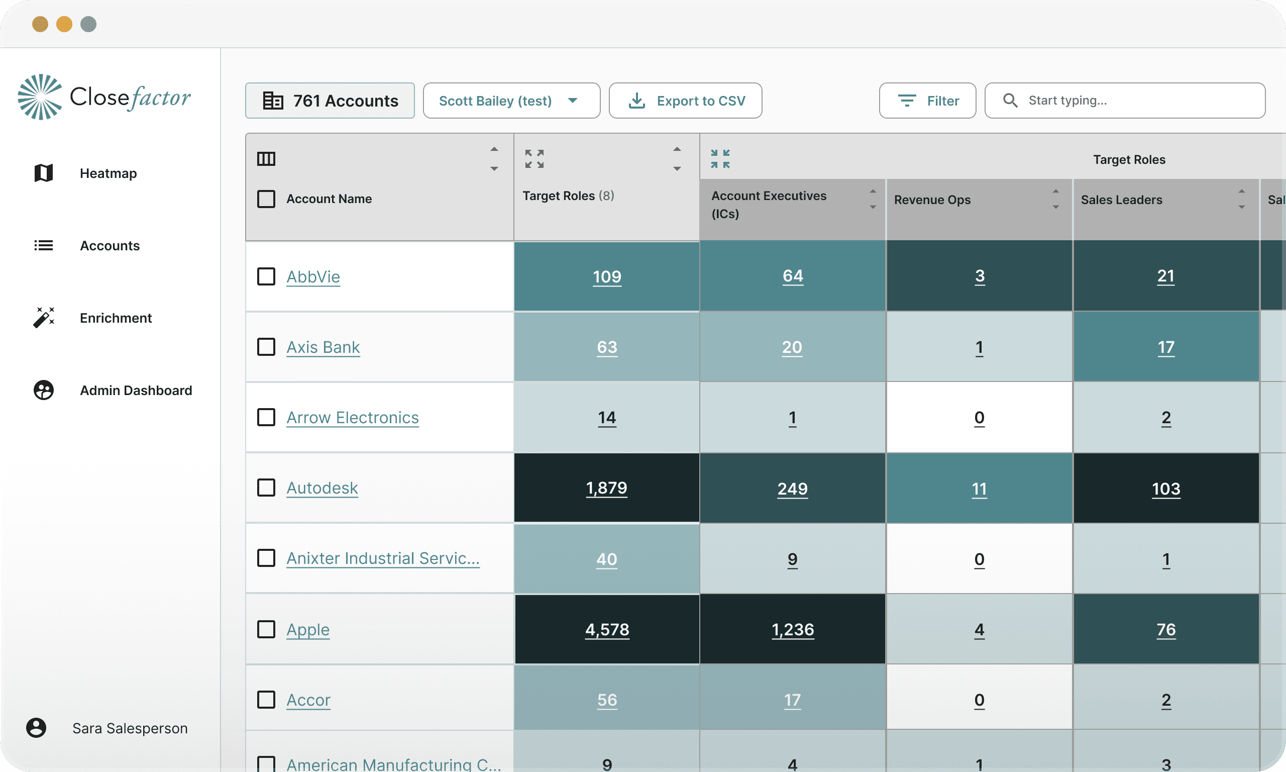
Before State: Heatmap
In the before state, this workflow was handled by the users on the Heatmap. The Heatmap is CloseFactor’s most functionality-dense (and old) feature in the platform. It did “get the job done” when it comes to Account Prioritization, but it was limited with how much customization the user could do to it, it was confusing to users, espeically new ones, and wasn’t tailor-made to address the use case.
User Feedback
What wasn't working?
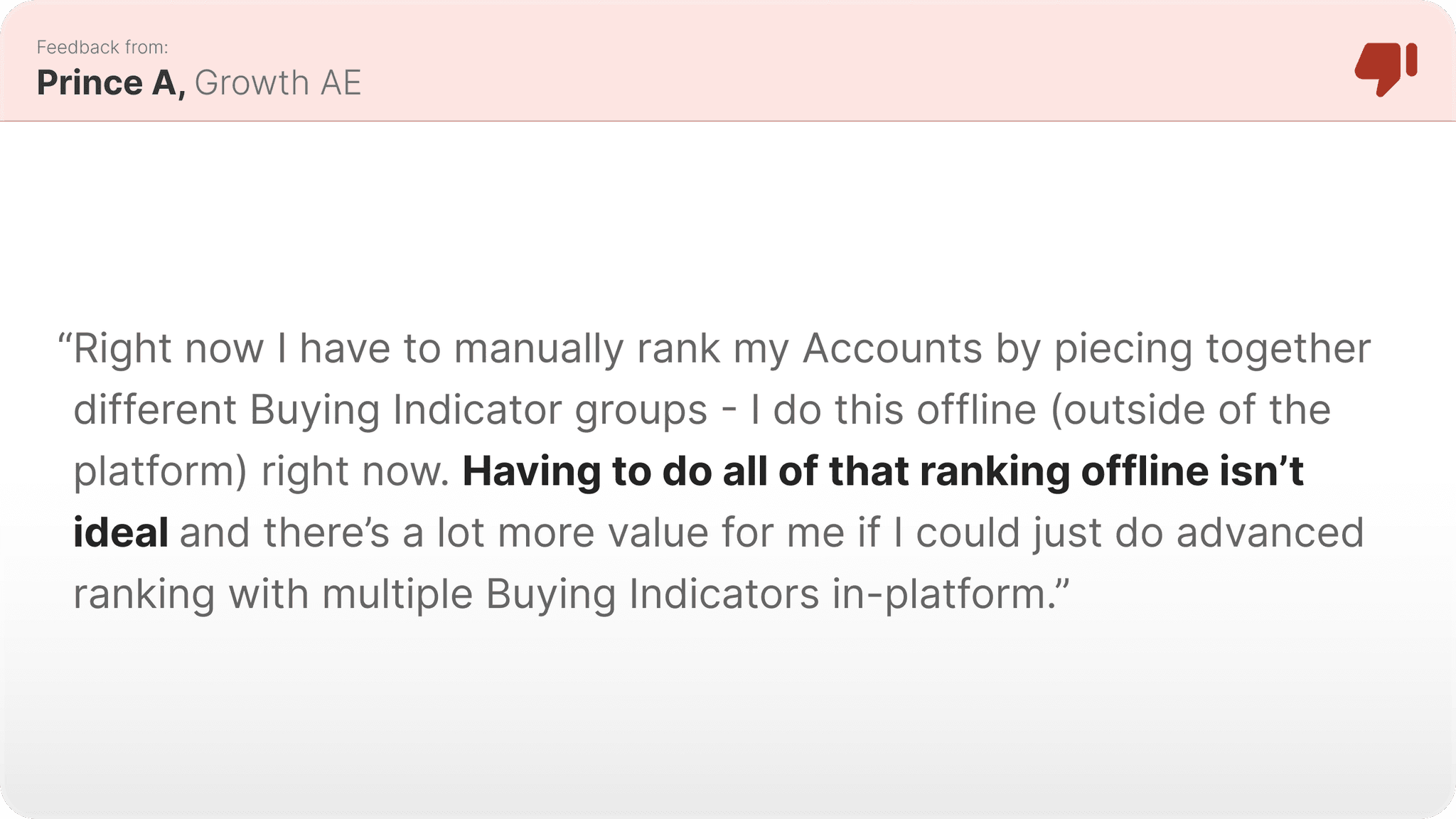
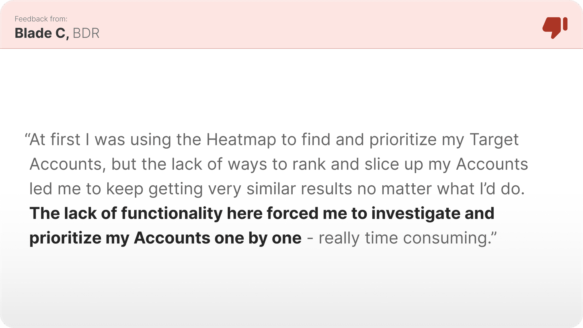
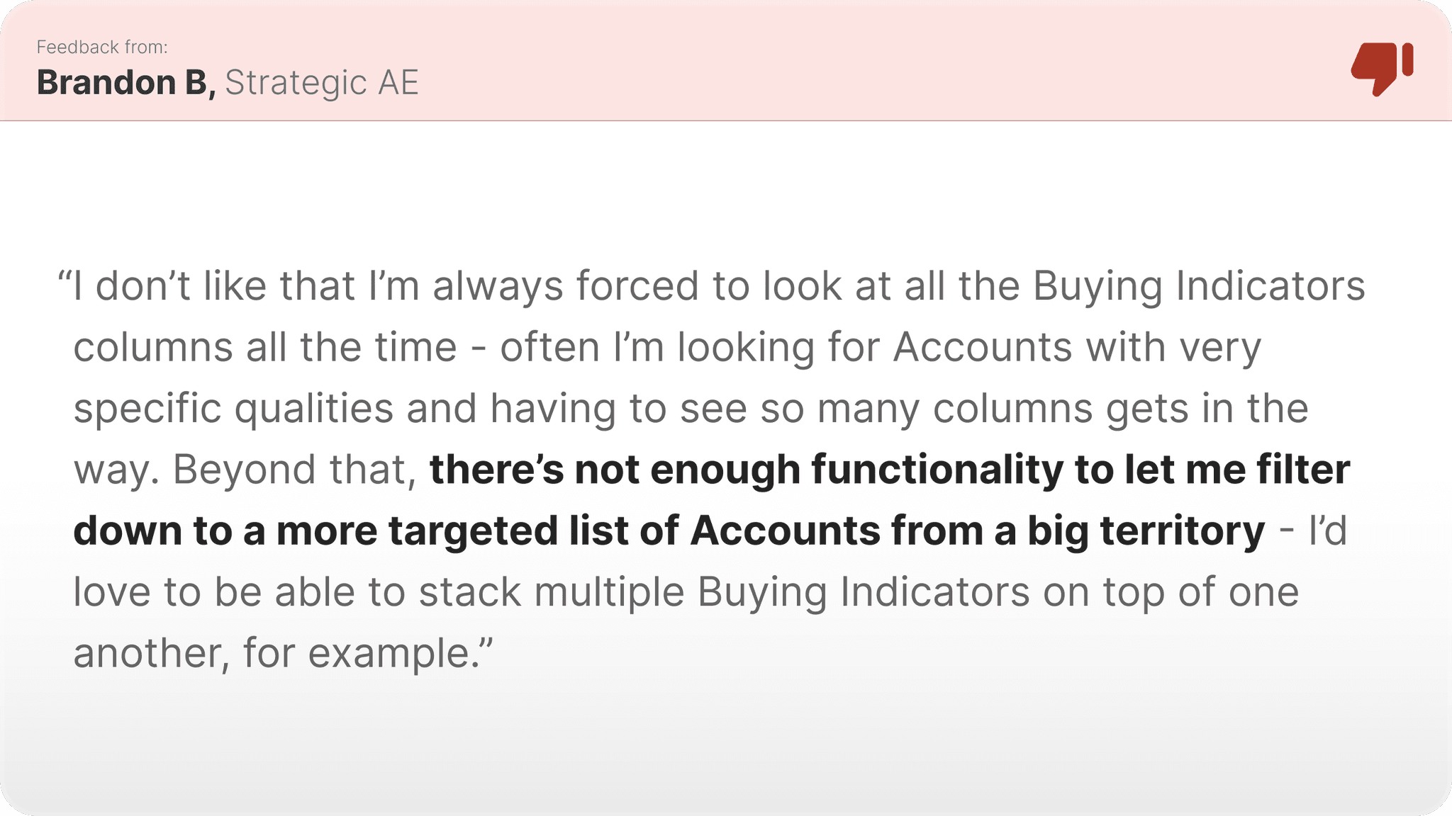
In more specific terms, the Heatmap didn’t support customized ranking and prioritization of Accounts - users were very limited to working within the confines of what the Heatmap’s column-sorting capabilities could do. This, plus an inability to filter down to a more targeted group of Accounts using custom threshold setting, really hurt the Heatmap’s viability for this workflow. And, it was simply cluttered, and put too much information in front of the user when they didn’t need it.
What to change?
Tactical Goal #1
Support Indicator Stacking
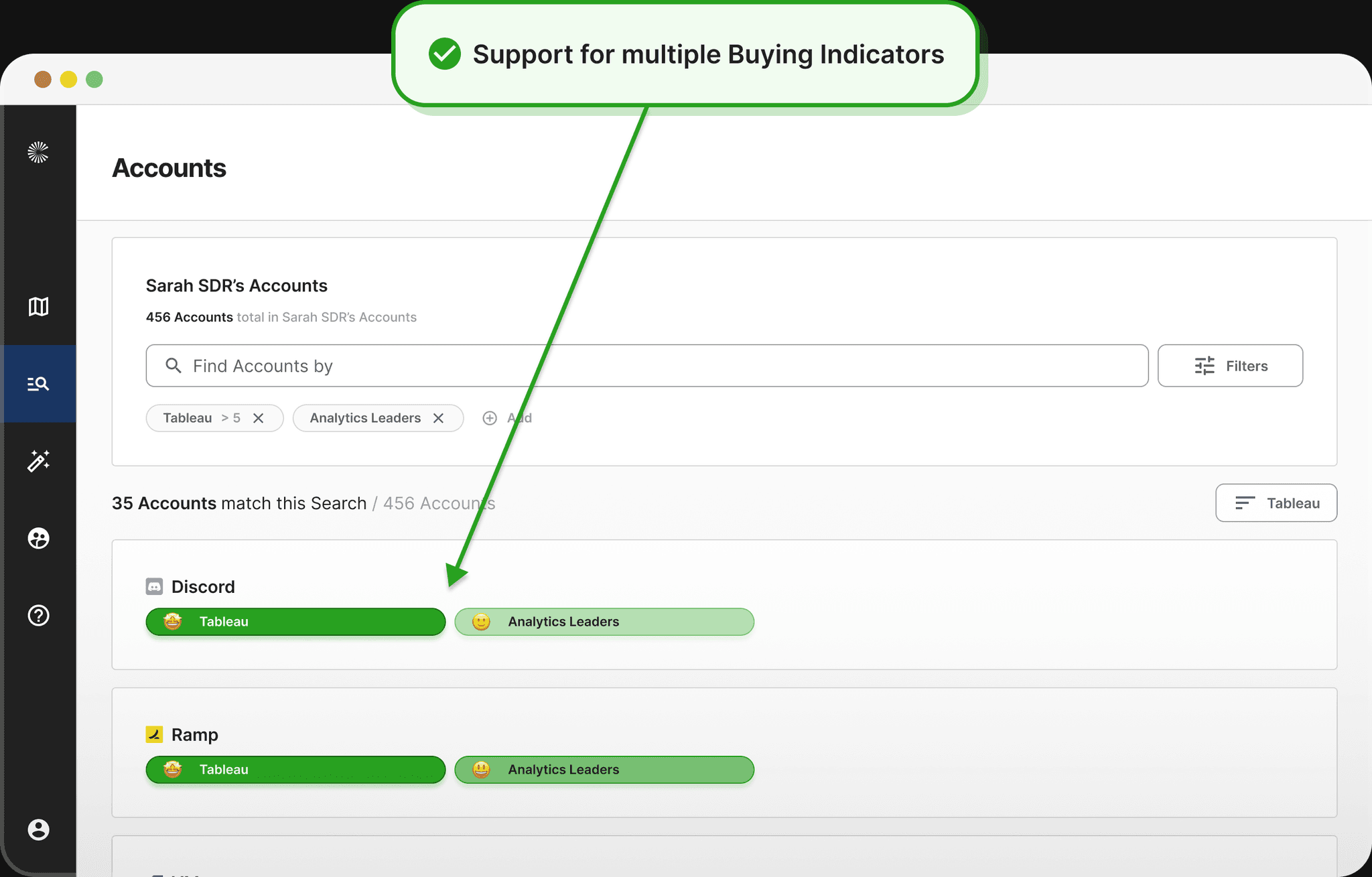
We want the users to be able to stack multiple Buying Indicators together to prioritize their Account exactly how *they* would like to.
Tactical Goal #2
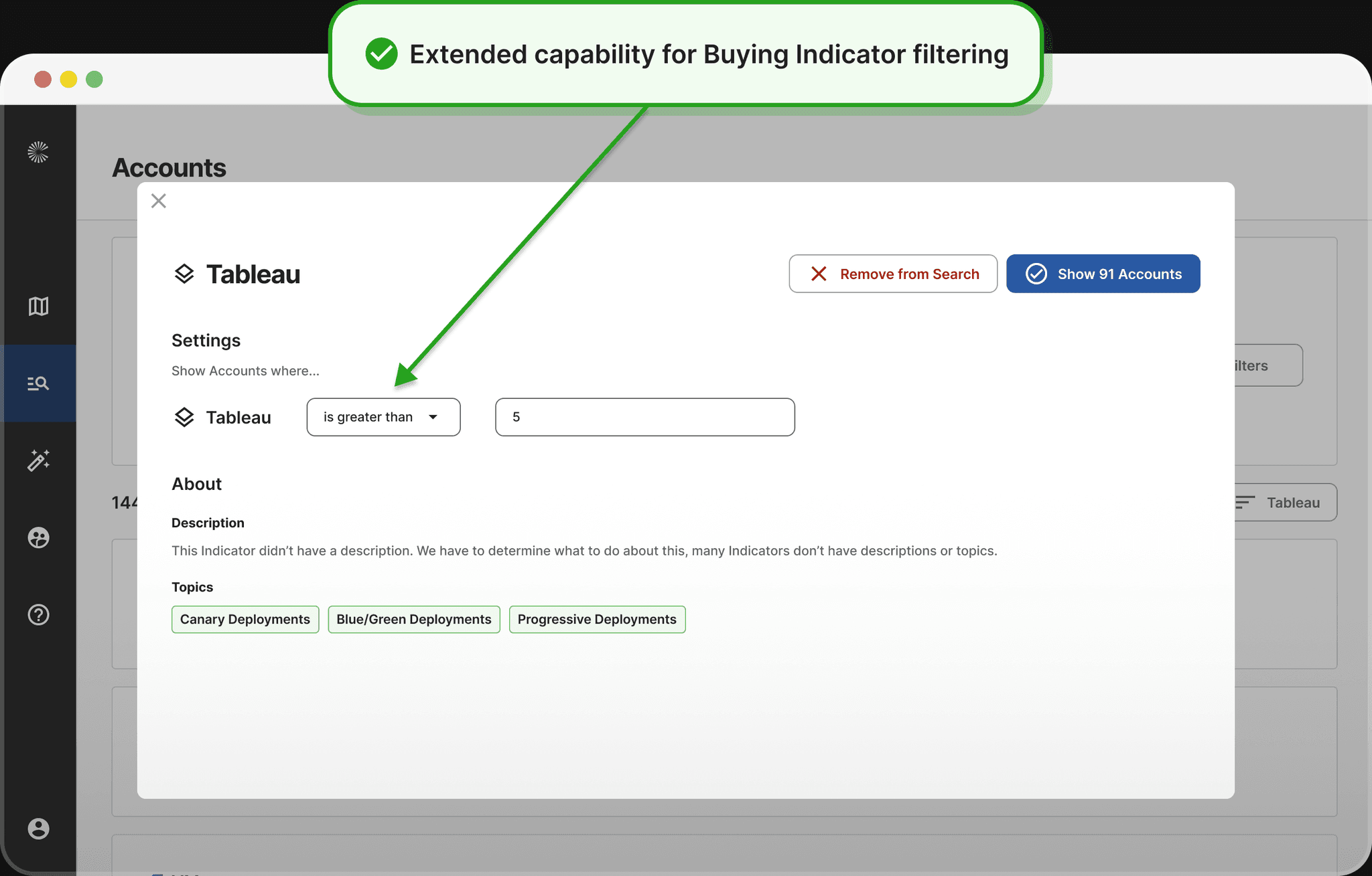
Add Custom Thresholds
We want the users to be able to set custom thresholds on Buying Indicators to let them get more specific with their Account filtering, enabling more customization than was previously possible.
Tactical Goal #3
Improve Ease-of-Use
We want the solution to be easier to use and easier to onboard to than the Heatmap - by creating a use-case specific solution, this was very doable.
Iteration #1
The first iteration introduced an all-new architecture to the Overview page - in which Buying Indicators were clearly grouped into one of the three core Use Case buckets. We also experimented with a new Buying Indicator Detail view page upon click, in which users could get more insight onto the clicked Buying Indicator and investigate Overlapping Tech Stack and mentioned by specific Buying Centers.
Iteration #2
The final iteration introduced the newest version of the CloseFactor Design System, and also drastically changed the hover and click behavior of the individual Buying Indicator cells. While the drill-in page from the previous iteration tested really well with our users, we had technical blockers that kept us from being able to move forward with those designs, so we had to scale back the concept and simplify the capabilities of that interaction. Nonetheless, the end result was useful and, according to the users and our engagement data, unlocked new value that hadn’t previously been found in this UI.
Iteration #3
The first iteration introduced an all-new architecture to the Overview page - in which Buying Indicators were clearly grouped into one of the three core Use Case buckets. We also experimented with a new Buying Indicator Detail view page upon click, in which users could get more insight onto the clicked Buying Indicator and investigate Overlapping Tech Stack and mentioned by specific Buying Centers.
Redesigned State: Account Prioritization UI
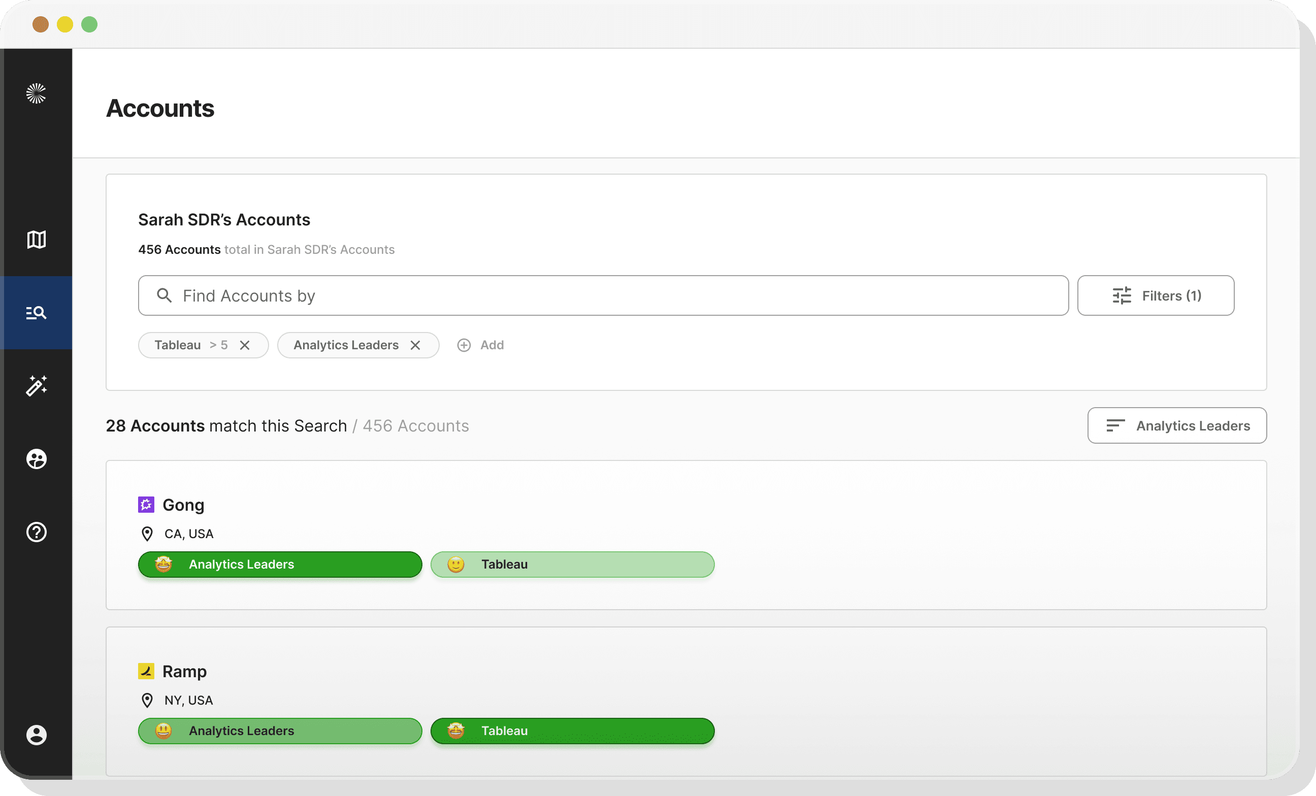
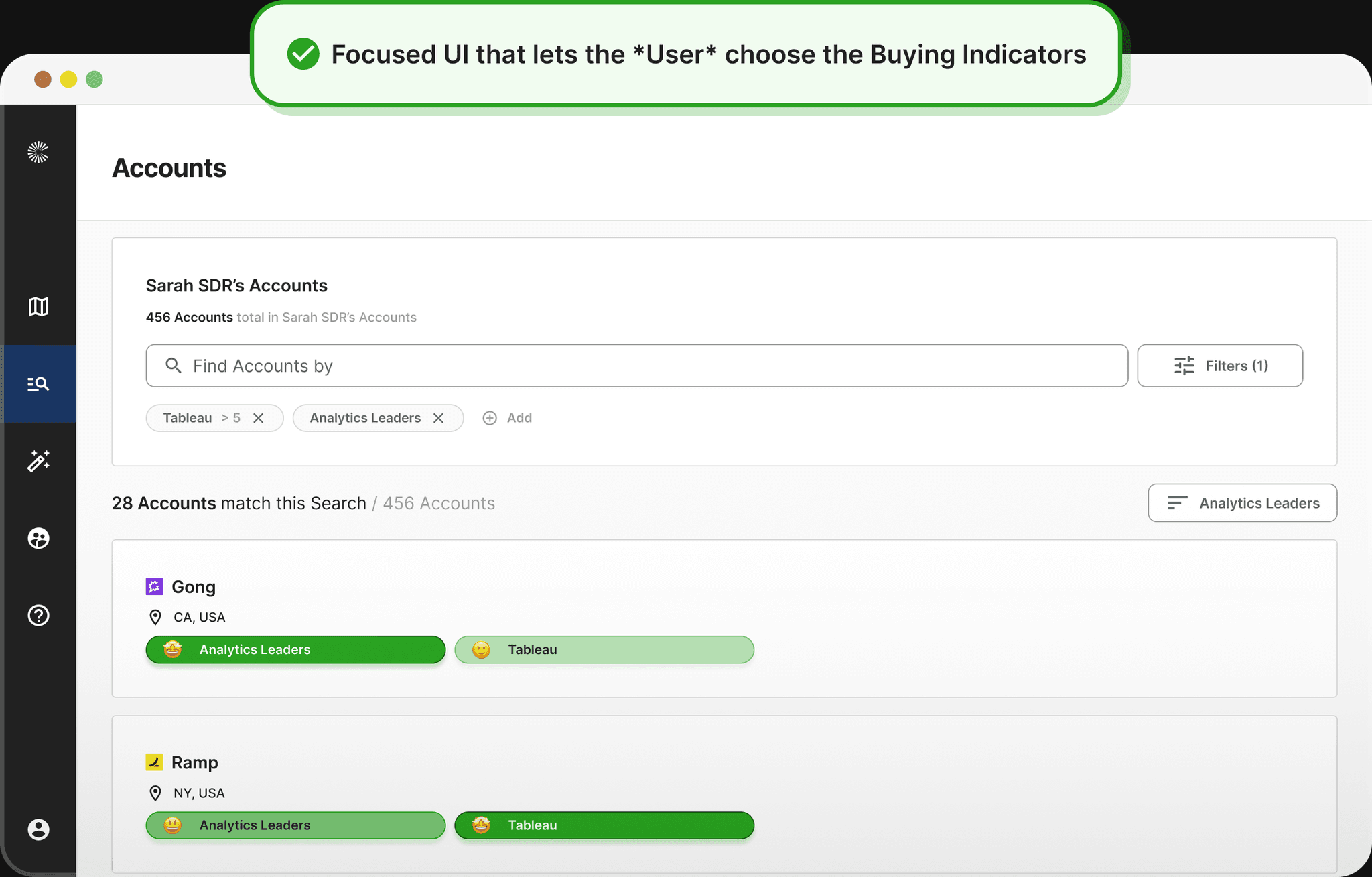
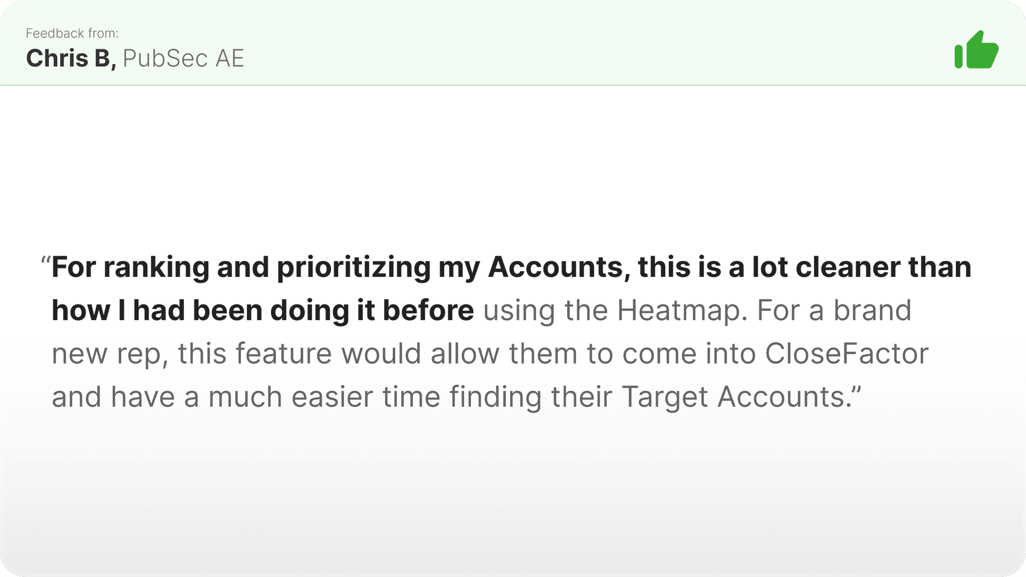
The redesigned state was a complete departure from the Heatmap - the prioritization workflow had been given its very own dedicated UI, which we hadn’t done in the platform anywhere before. It was cleaner, it was tailored to fit into the workflow of the user, and really customizable, to the extent that users could set up really advanced searches and prioritizations of their territory quickly, and much easier than had been possible previously.
What changed?
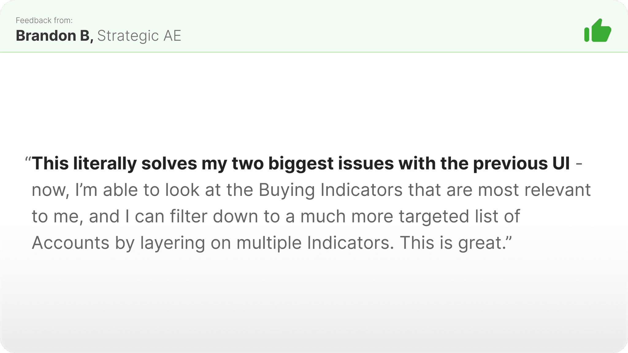
In an effort to directly address the changes to be made that I’d identified above, the first (and most substantial) change was the ability for the user to select *multiple* Buying Indicators to user for their analysis and prioritization activity. The new UI also includes threshold-setting for any and every filterable dimension, and writ large, the UI is much cleaner and simpler. And - based on the feedback we received - much easier to onboard to than the Heatmap.
User Response
User response was really positive with this change, which was great to see. Here we were basically introducing an entirely new feature into the top-level nav of the platform, so frankly, the stakes were high. But it became clear and obvious pretty quickly that we had solved some big problems and unlocked new, previously-unrealized value with this redesign.
Account Planning & Messaging Workflow
Once the AE or BDR has identified their list of "Target Accounts", they need to come up with a great plan for how they're going to approach each Account. The user wants to come up with a solid understanding of how an Account is spending money, how an Account is using technology, and who at an Account is the right person or people to talk to about these things. Great sales people dedicate significant time to researching this.
Before State: Overview
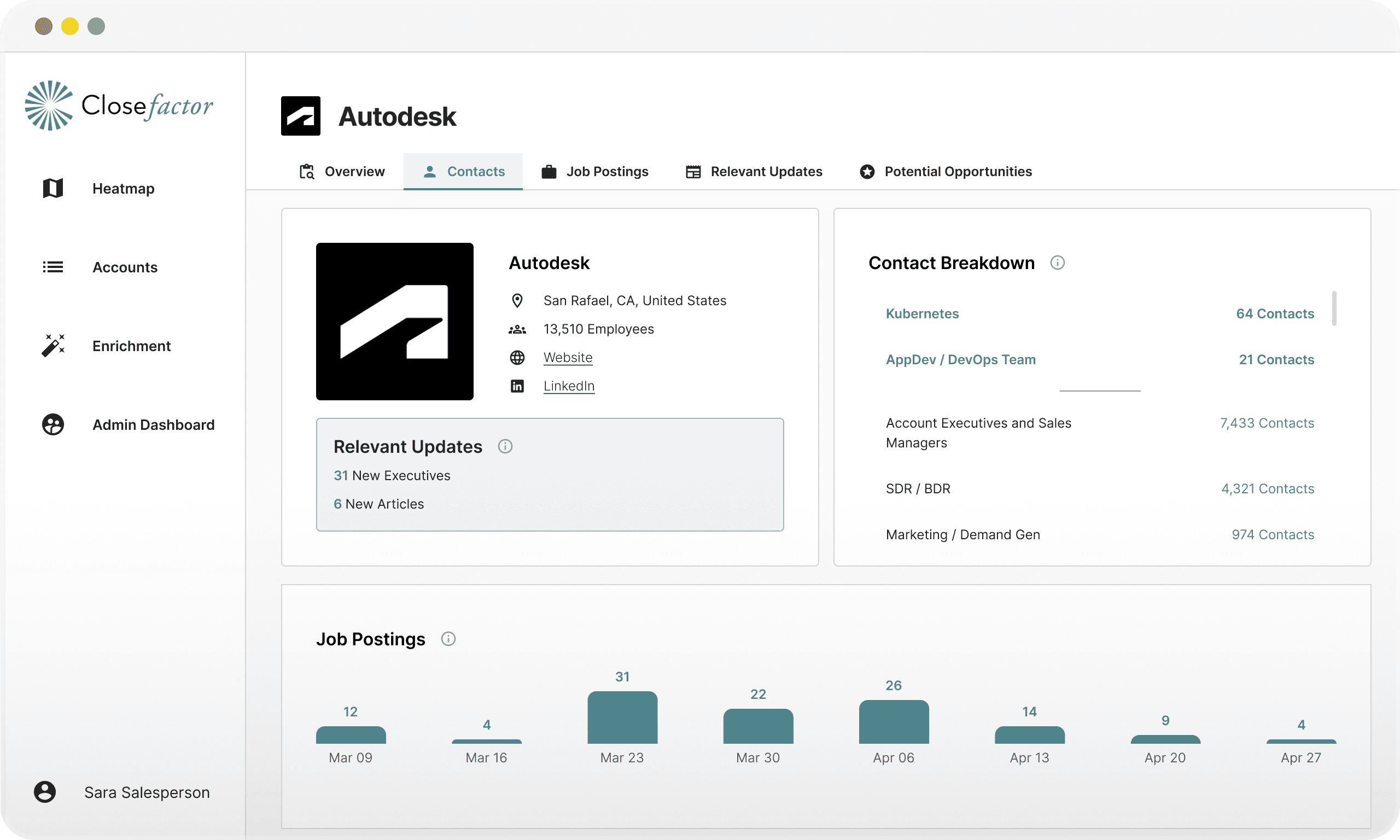
In the before state, this workflow was handled by the users on the Overview page. The Overview is the users’ first view into an Account, and one that should give the users an idea of what’s going on inside of an Account, even if it’s brand new to them. It did “get the job done” to a degree, but it didn’t tell much of a story about an Account - the UI was really just putting up some data, but it was unstructured. Now, though, with our new architecture, we could feasibly structure the UI in an entirely different way.
User Feedback
What wasn't working?
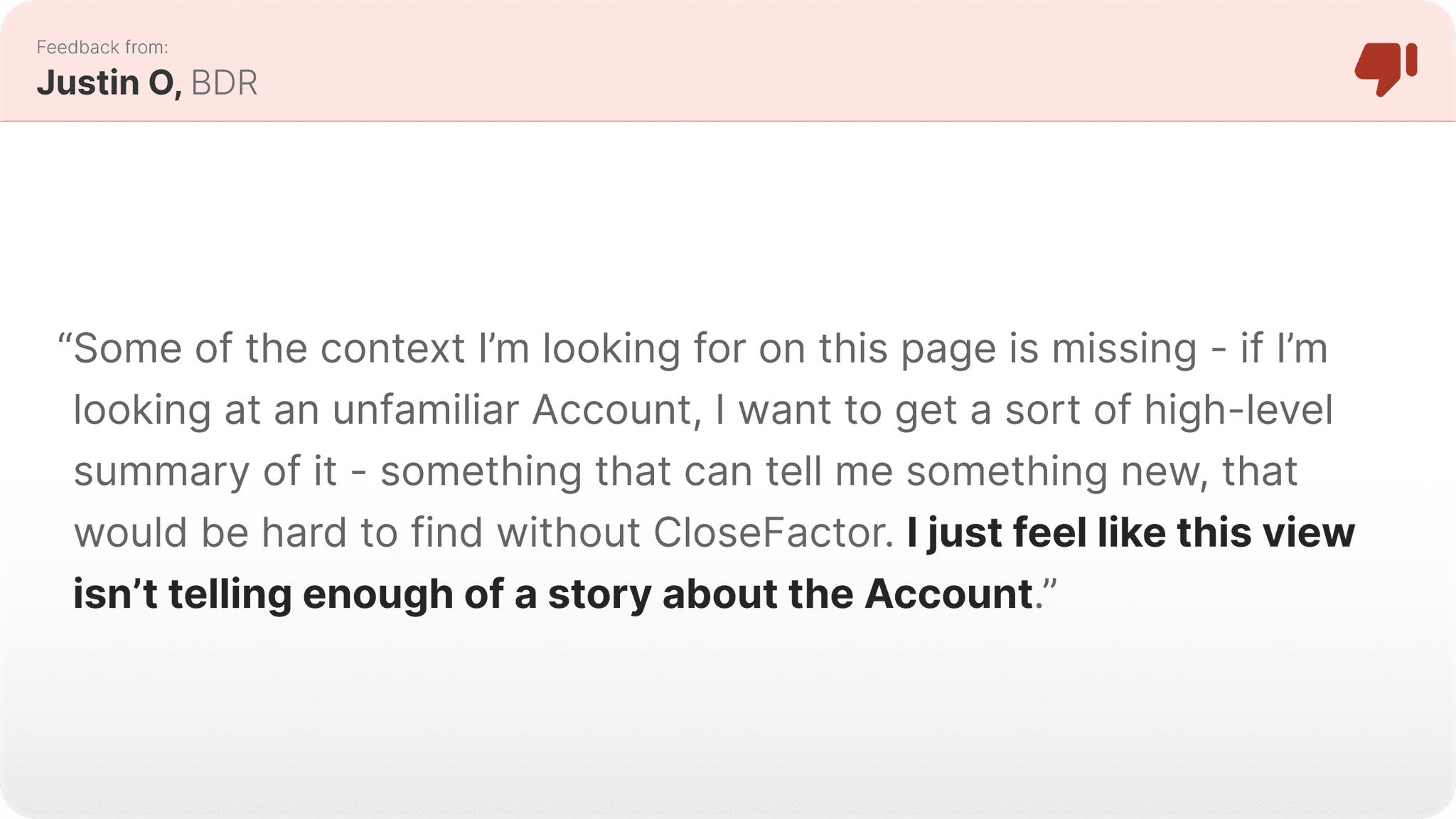
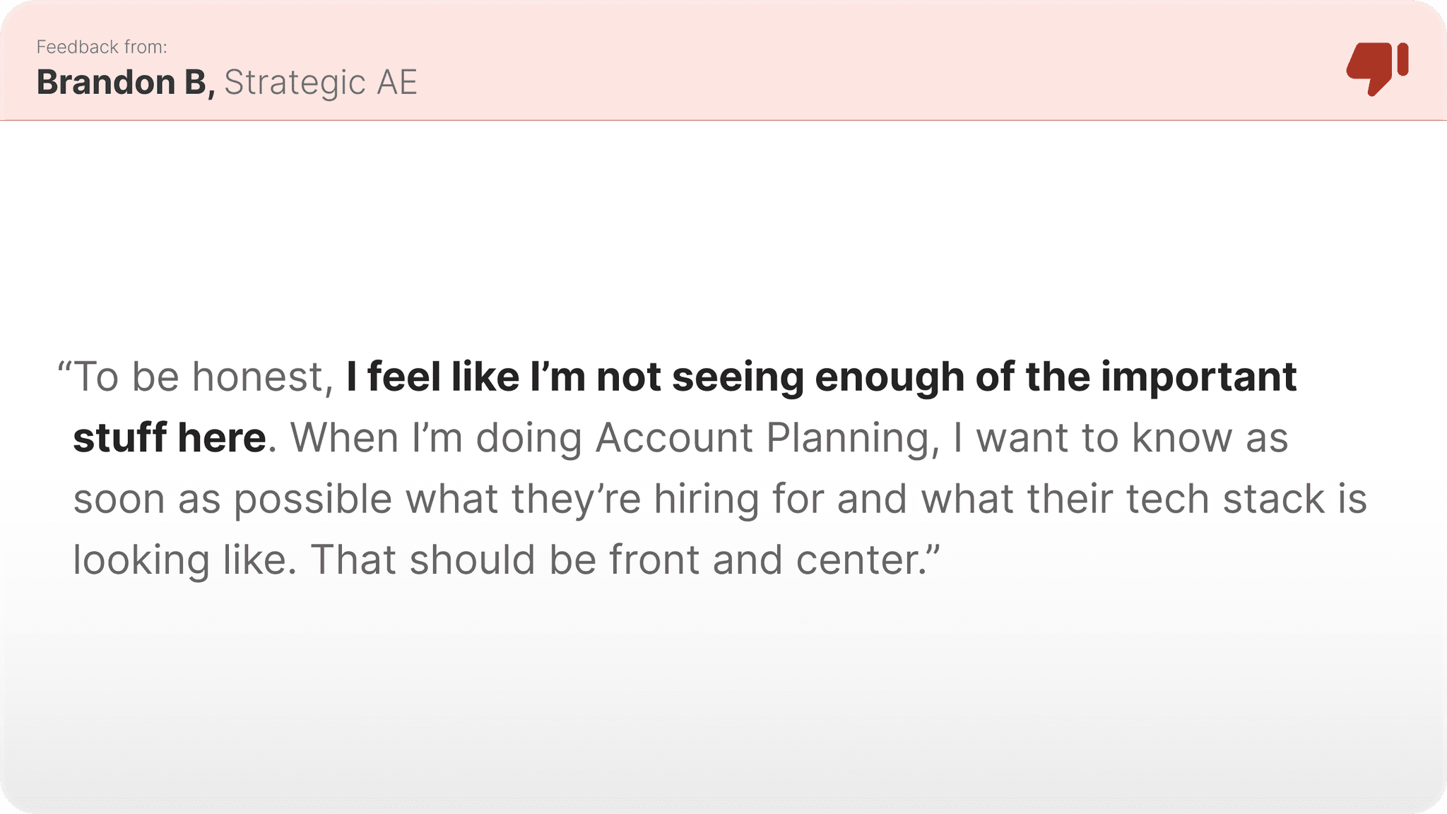
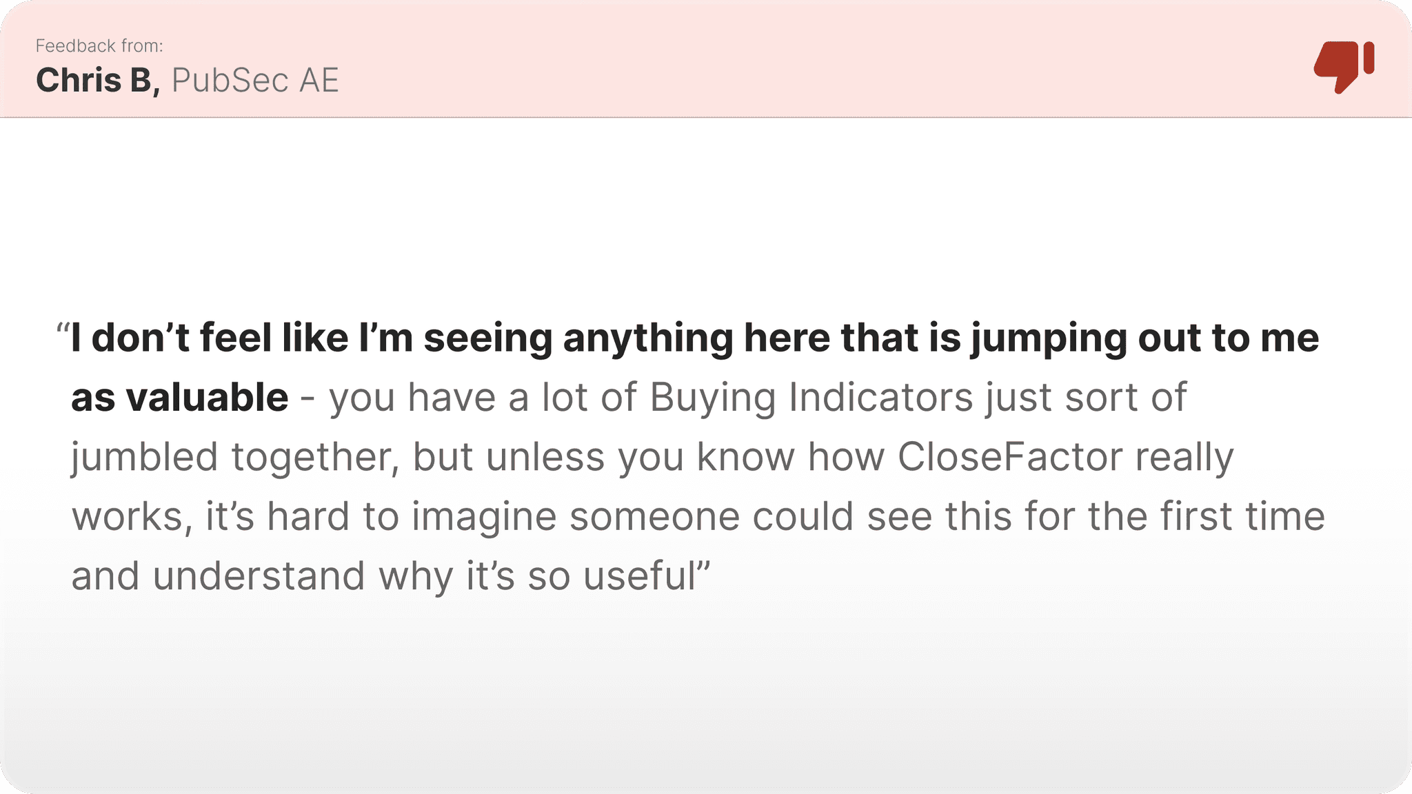
The Overview didn’t do enough to really tell a user what they need to know about an Account - the insights on the Overview were okay, but not great. We were bunching up all of the (very different) Buying Indicators together, not giving enough oxygen to the Contacts on this page, and not doing enough to make the use cases of the different Buying Indicators clear.
What to change?
Tactical Goal #1
Clearer Account Summary
We want the users to be able to easily understand the meaning of and the utility of the Buying Indicators, even if it’s their very first time using the platform.
Tactical Goal #2
Buying Indicator Groupings
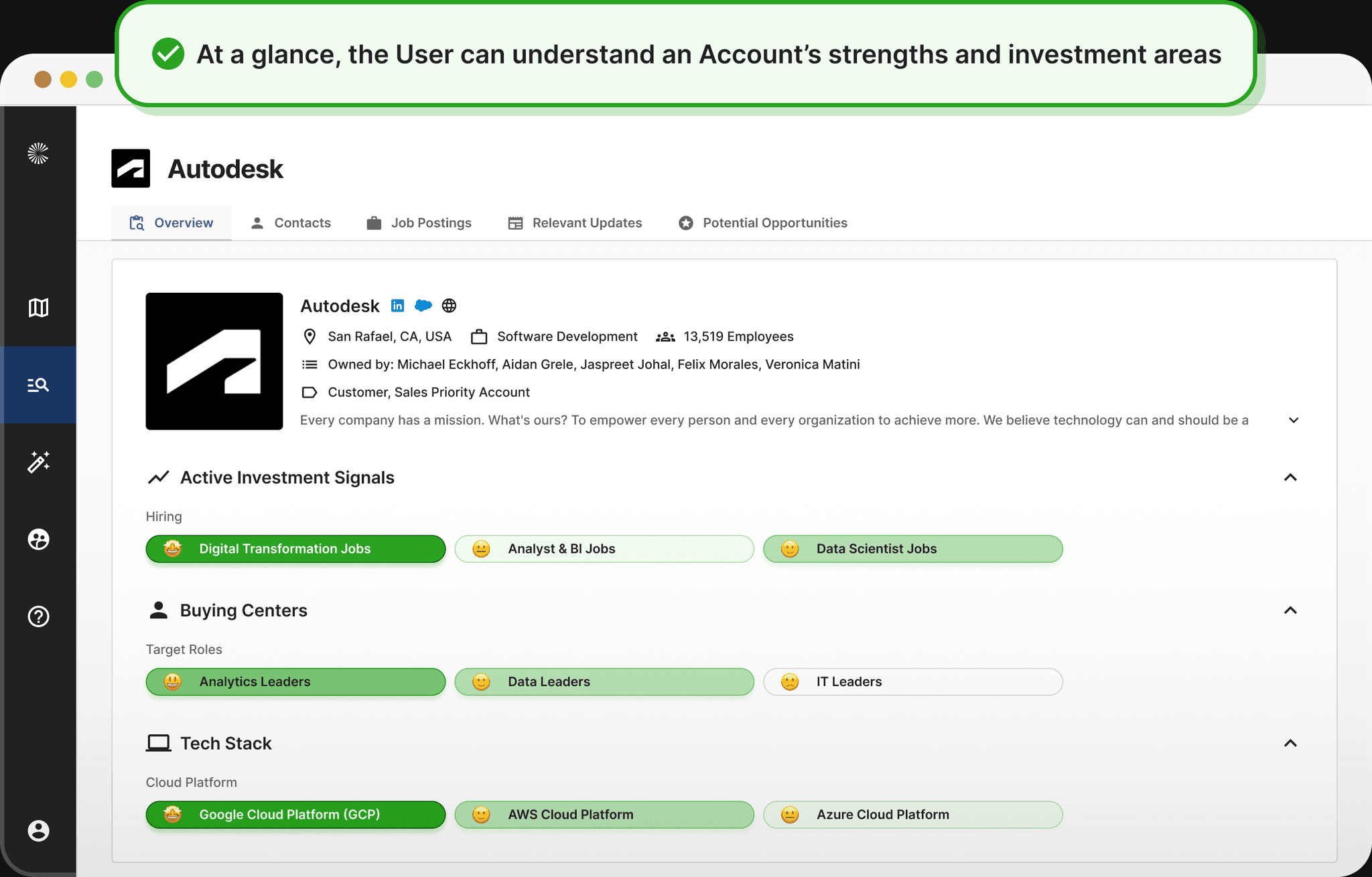
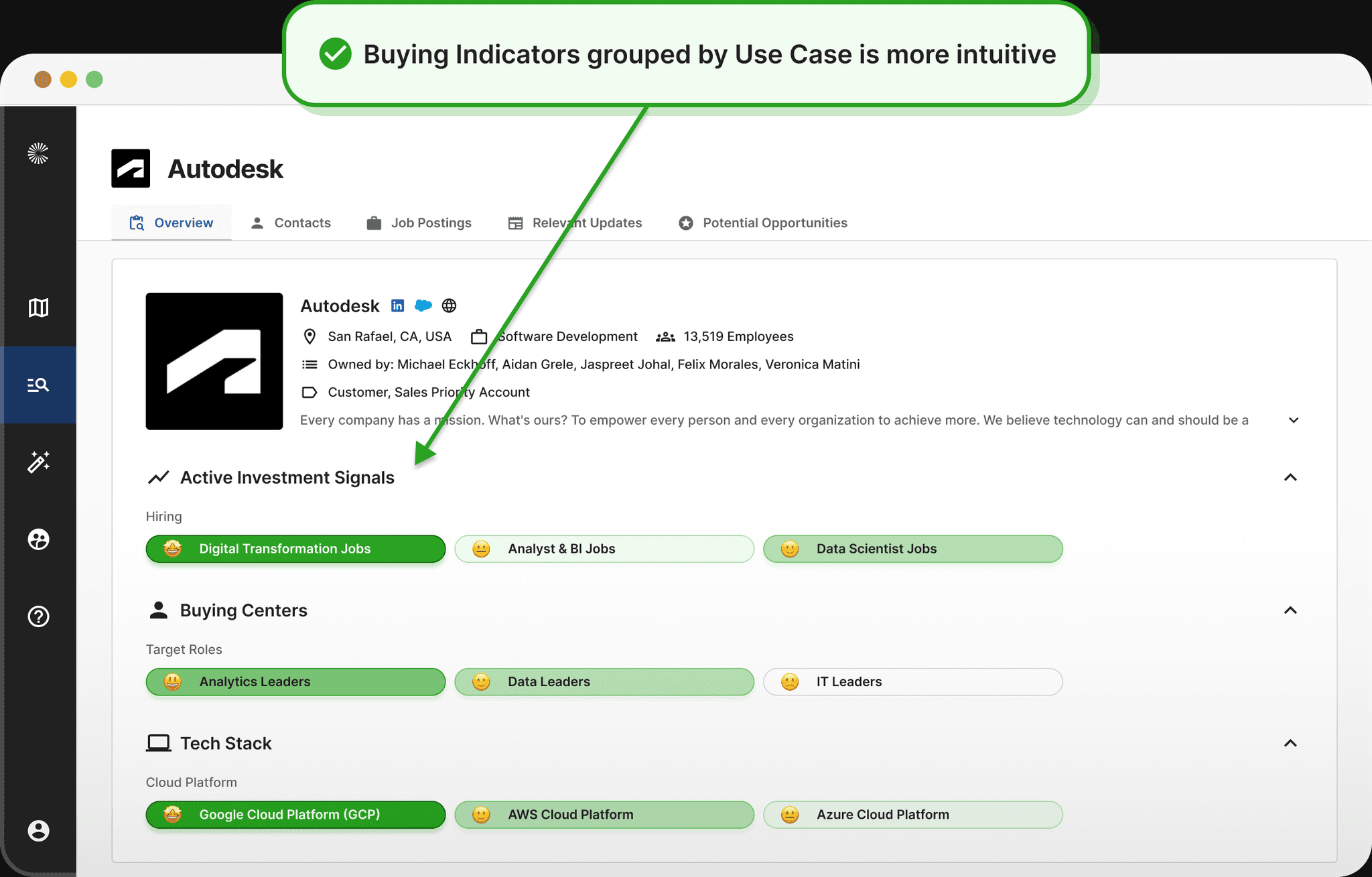
We want to group the Buying Indicators by Use Case so that when the users do arrive on the Overview UI, they can easily and intuitively understand how an account is spending money, what tech an Account has in use, and what kinds of decision makers they have.
Tactical Goal #3
More Space for Contacts
We want Contacts to have more real estate and presence in the redesigned UI - Contacts are the vessels through which the users take action on an Account, and not having them so prominent in the current state hinders actionability.
Iteration #1
The first iteration introduced an all-new architecture to the Overview page - in which Buying Indicators were clearly grouped into one of the three core Use Case buckets. We also experimented with a new Buying Indicator Detail view page upon click, in which users could get more insight onto the clicked Buying Indicator and investigate Overlapping Tech Stack and mentioned by specific Buying Centers.
Iteration #2
The final iteration introduced the newest version of the CloseFactor Design System, and also drastically changed the hover and click behavior of the individual Buying Indicator cells. While the drill-in page from the previous iteration tested really well with our users, we had technical blockers that kept us from being able to move forward with those designs, so we had to scale back the concept and simplify the capabilities of that interaction. Nonetheless, the end result was useful and, according to the users and our engagement data, unlocked new value that hadn’t previously been found in this UI.
Redesigned State: New Overview
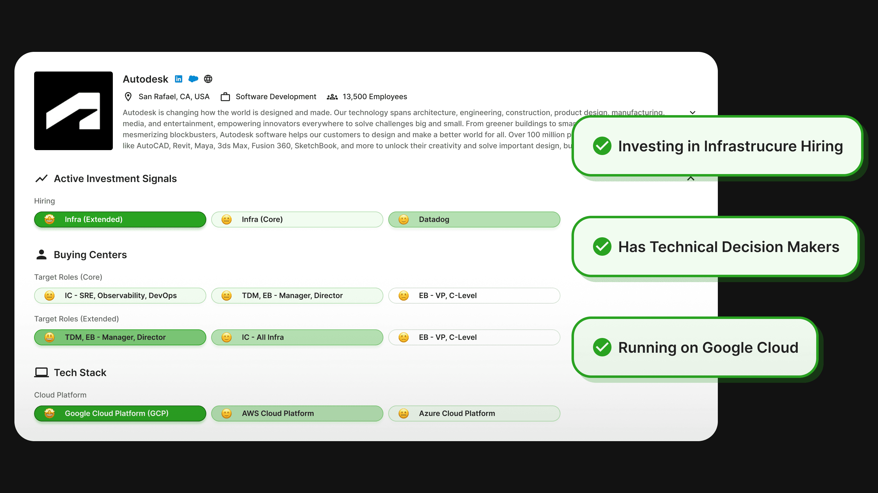
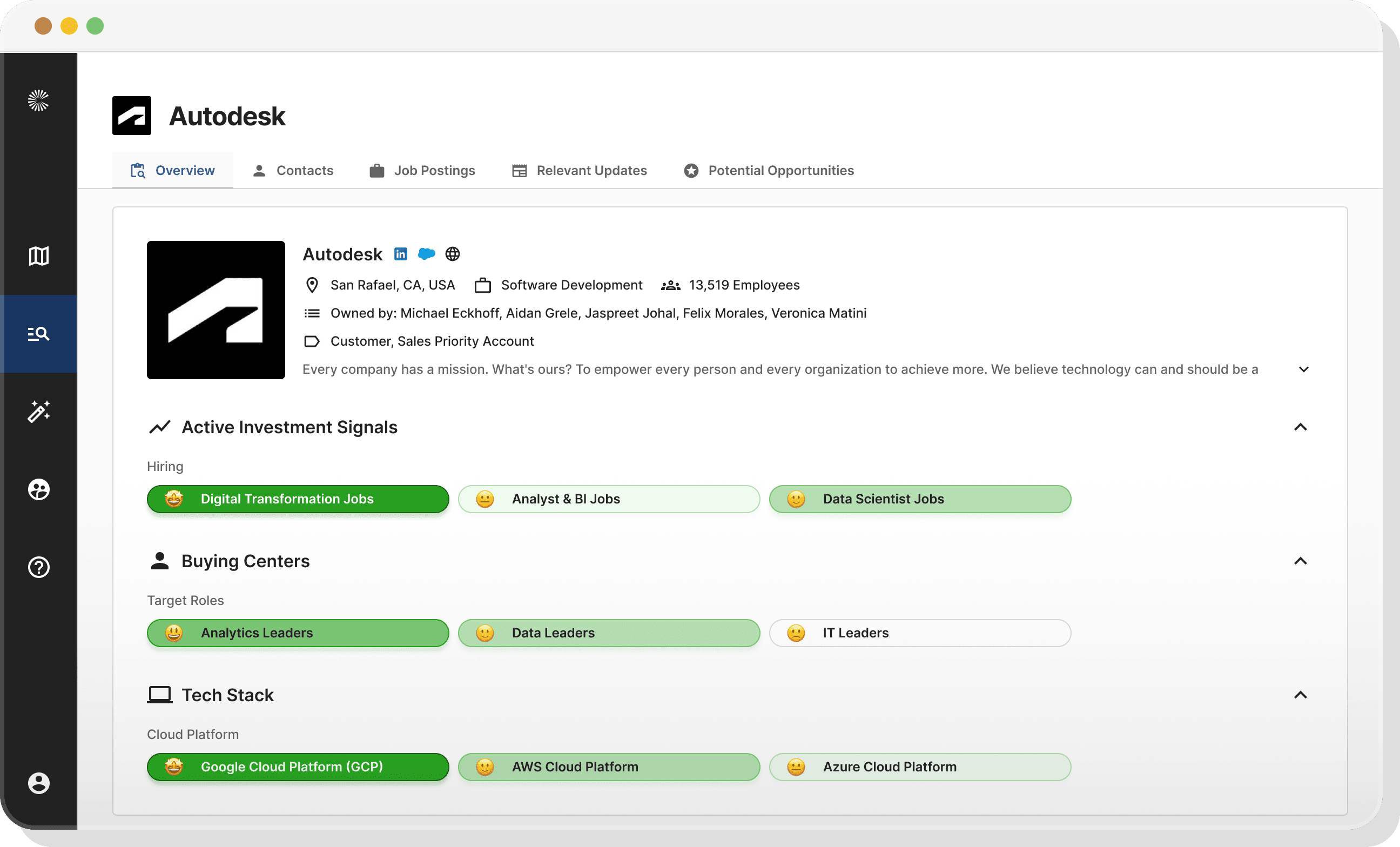
The redesigned state was a complete overhaul relative to the before state - we introduced an entirely new way of displaying the Buying Indicators on this page, and introduced brand new categorizations and interactions into this page - all for the sake of making it easier to use and helping the user unlock more value from the Buying Indicators. It was cleaner, it was tailored to fit into the workflow of the user, and much more intuitive than the previous state.
What changed?
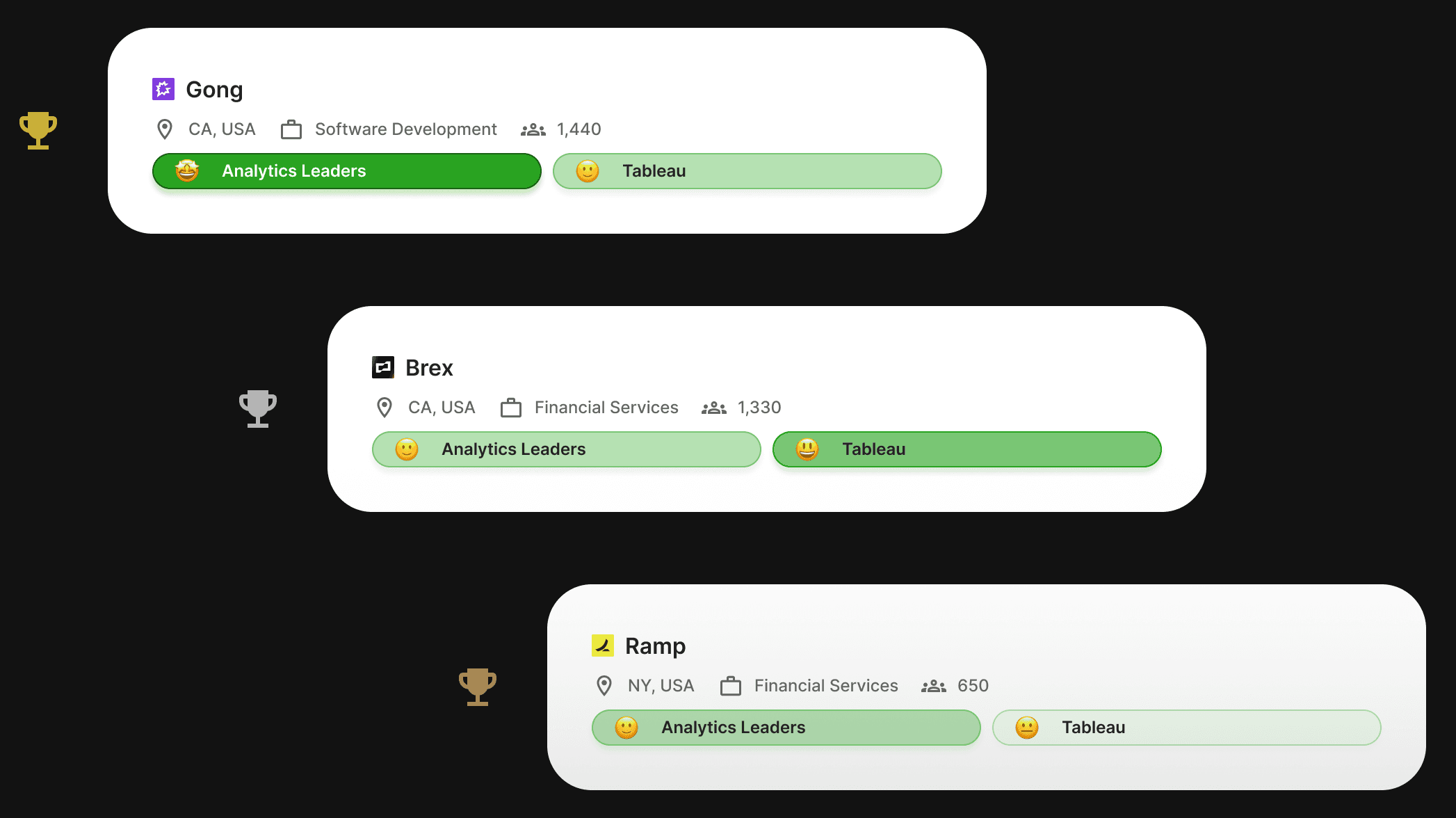
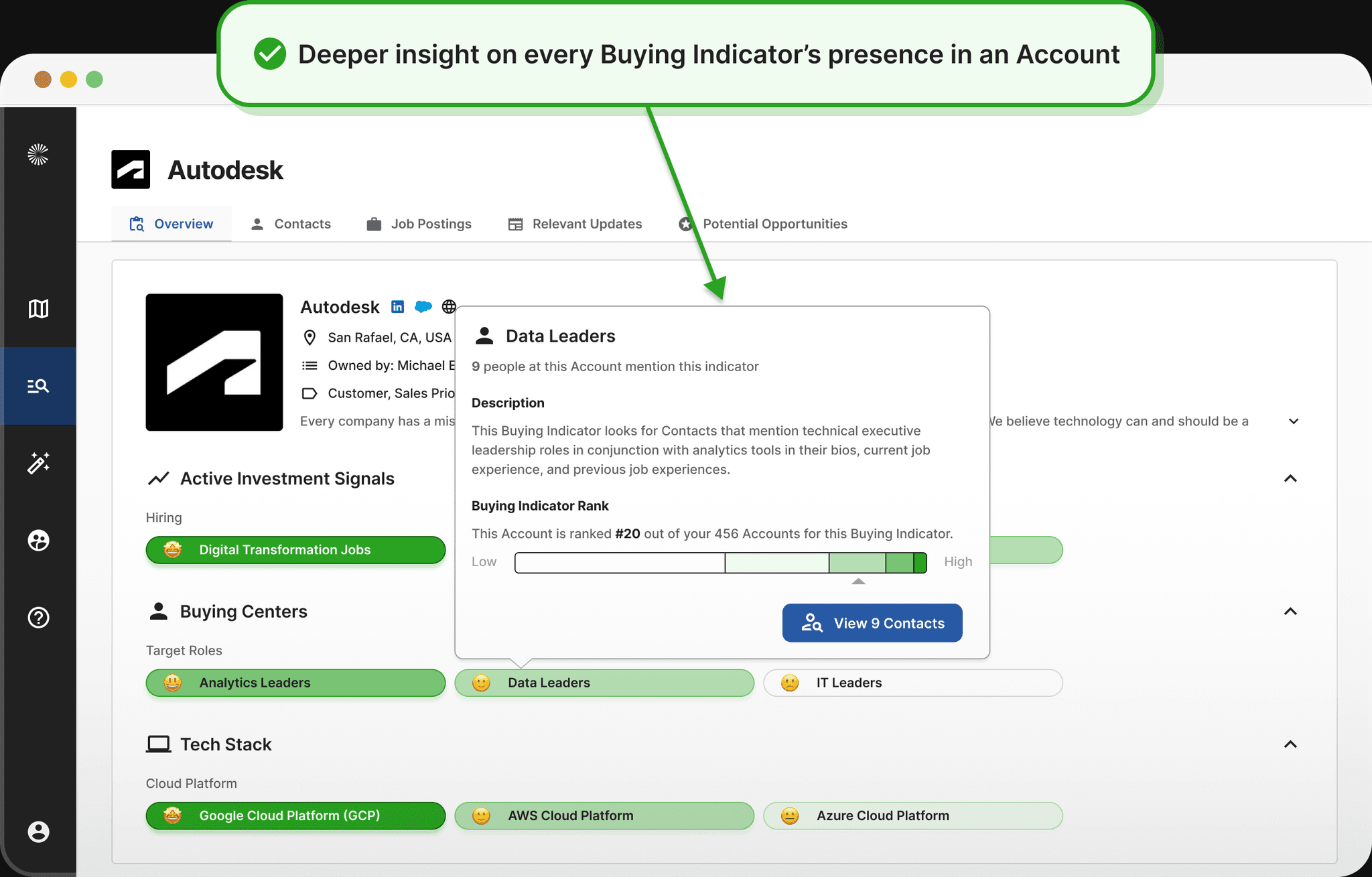
In an effort to directly address the changes to be made that I’d identified above, the first (and most substantial) change was the new display style of the Buying Indicators themselves - broken down into this new chip-style, color-coded format, with the new added structure introduced by the sectioning of the Buying Indicators by Use Case. The new UI also includes advanced, insight-packed hover state for each Buying Indicator, and writ large, the UI is much cleaner. And - based on the feedback we received - a far more effective and insight-packed “Overview” than the previous state.
User Response
User response was really positive with this change, which was great to see. Here we were completely redesigning a popular and heavily-used feature in the platform, so the stakes were high. But it became clear and obvious pretty quickly that we had solved some big problems and unlocked new, previously-unrealized value with this redesign.
Launch
The prior stages took place over a series of months - with ideation starting in Fall of 2022 and the final product launching in early 2023. Now that the redesign has been in production for some time, we’re able to look back and reflect on the progress made, and understand what kind of impact the redesign project had on the affected features, on the platform, and of course, on the users.
Reminder: What did we want to accomplish by redesigning the Buying Indicators?
Tactical Goals
Utility, Structure, Product Capability
We wanted the users to be able to easily understand the meaning of and the utility of the Buying Indicators, we wanted the Buying Indicators to be presented consistently and predictably in the UI, and we wanted to remove the limits to the platform brought about by unstructured Buying Indicators.
Strategic Goal
Increase User Engagement
We wanted to see a noticeable bump in User Engagement after releasing the redesign, on both a feature-level and a platform-level.
Qualitative Impact: Happier, more delighted users.
From a qualitative perspective, response to the launch of the redesign was quite positive. The new and improved workflows added value to the platform, and users were particularly thankful that we’d made clear we listened to their pain and design a solution to remove it. In 1:1 UXR calls and onboarding sessions I was a part of after launch, it was clear to me that there was less friction for newer users when onboarding to these workflows now, where there had previously been noticeable confusion. From a big picture perspective, I would call this redesign a success.
Account Prioritization
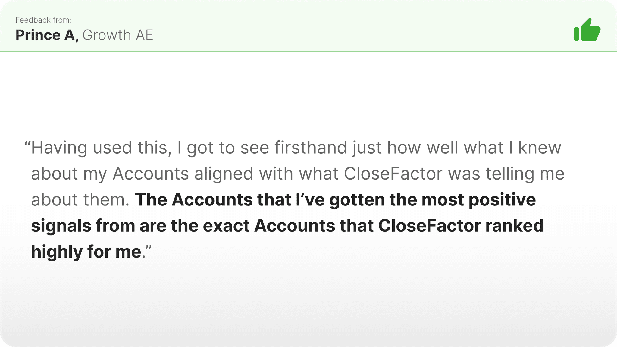
Based on the feedback received, the new Account Prioritization UI and workflow seemed to have directly solved the biggest pains of the previous state involving the Heatmap. According to the users, the biggest value unlocked centered on the new ability to stack multiple Buying Indicators together and set custom thresholds and limits on individual Buying Indicators, with the net result of enabling them to create significantly more targeted searches of their territory than had been previously possible. At a higher level, we heard that this UI was simply easier to understand than the Heatmap, which is exactly what we’d hoped for.
Account Planning
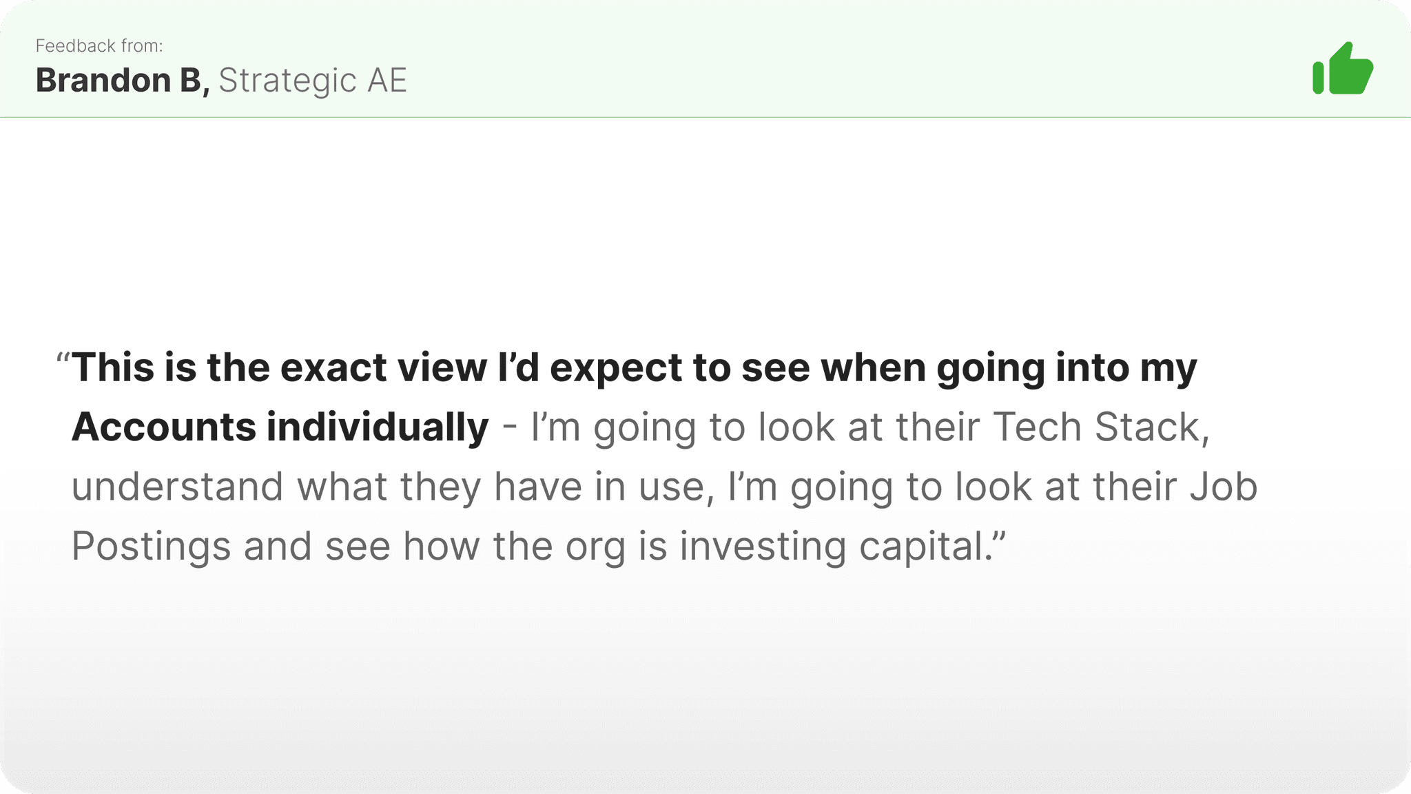
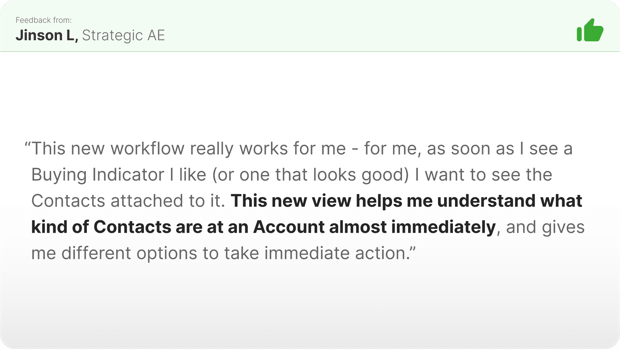
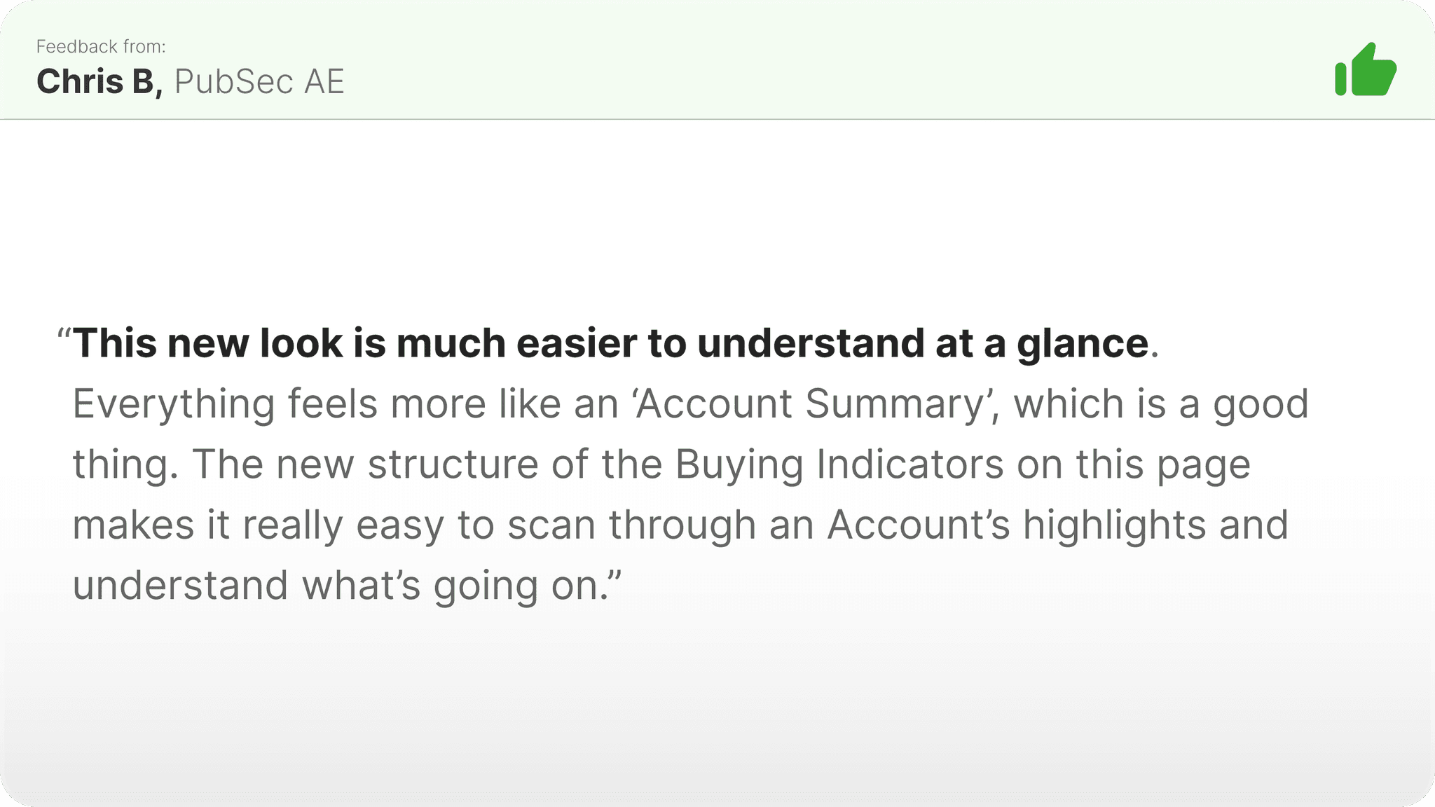
Based on the feedback received, the new Account Planning workflow (and the redesigned Overview UI) seemed to have directly solved the biggest pains of the previous state involving the old Overview. According to the users, the biggest value unlocked centered on the new presentation style and ranking of the Buying Indicators, with the net result of enabling them to “understand” what an Account’s investment, business initiatives, tech stack, and key Contacts look like at just one glance, something that used to take minutes if not hours of manual searching across the web. At a higher level, we heard that this UI made understanding what the Buying Indicators are actually meant for easier, which is exactly what we’d hoped for.
Quantitative Impact: Increased Feature-level and Platform-level user engagement.
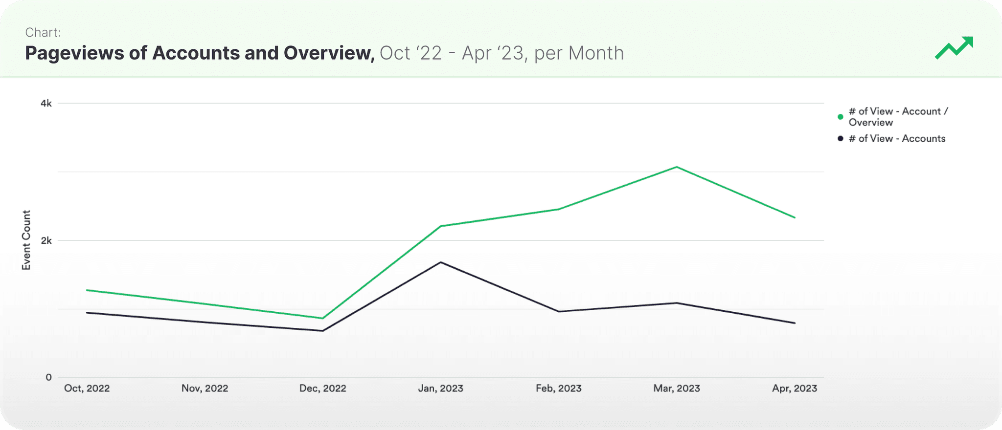
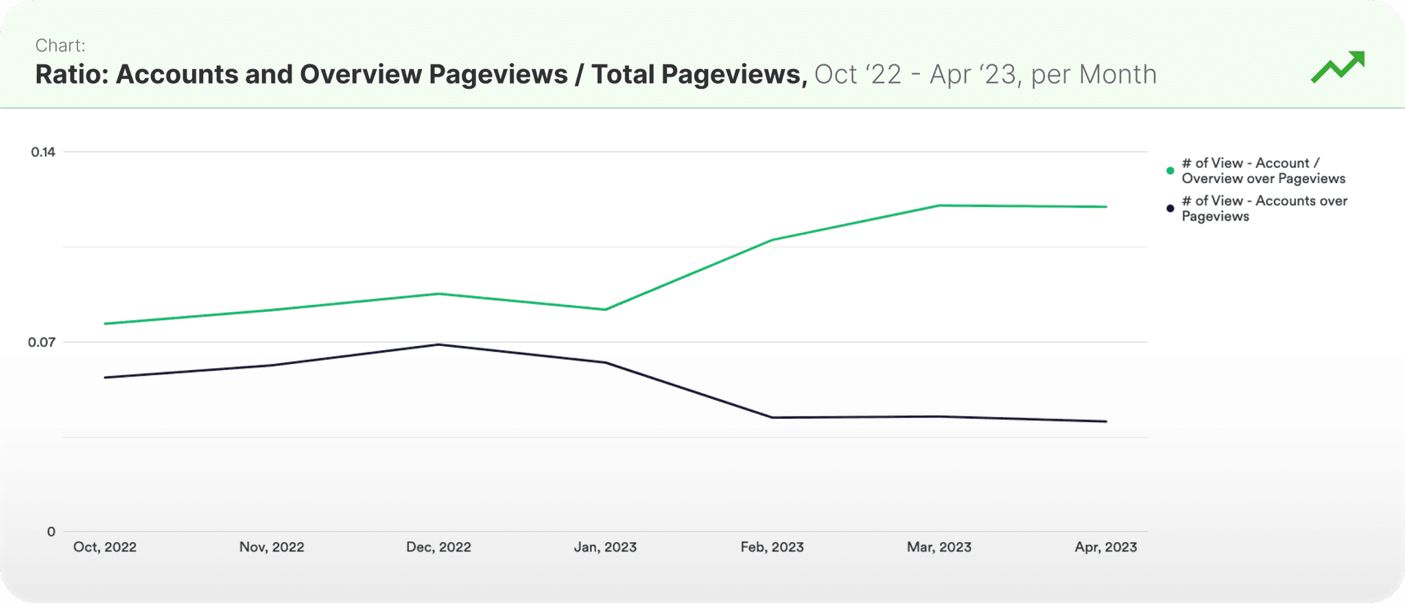
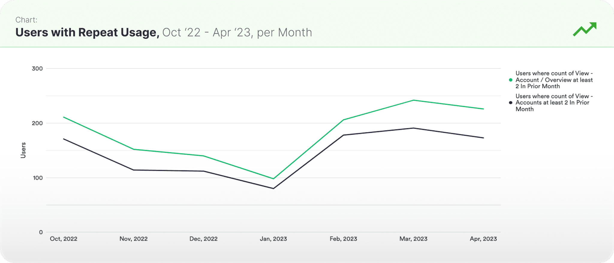
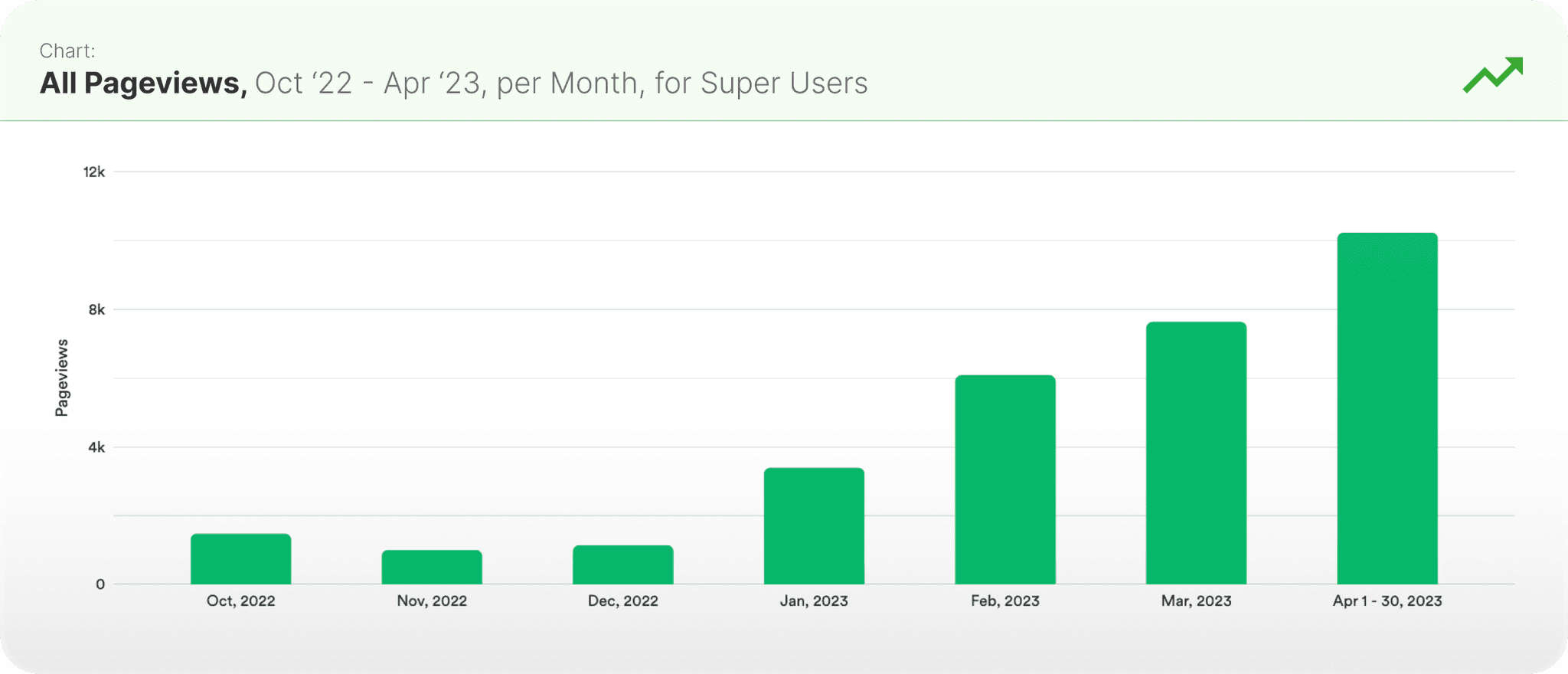
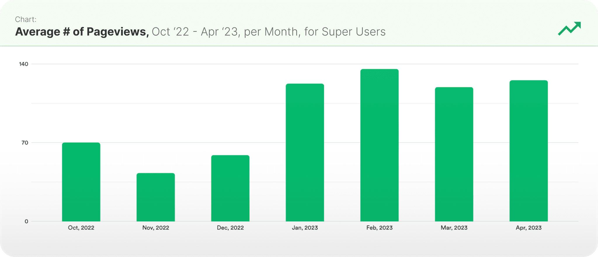
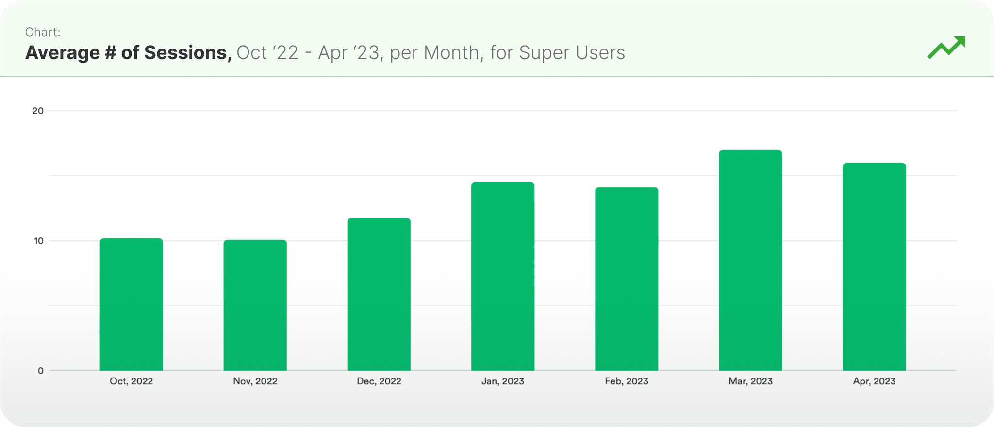
From a quantitative perspective, in-platform engagement following the launch of the redesigned workflows saw notable improvement. From the feature-level, pageviews on the redesigned Overview increased, as did the pageview ratio for Overview. Repeat usage on these features, which had been slumping in the months leading up to the launch, bounced back to the previous highs, even setting a new high for the Overview UI. From the platform-level, all pageviews increased post-launch, with the avg. number of pageviews per user per month roughly doubled following the launch. The avg. number of sessions per user per month also saw a steady increase post-launch. In summary, we can see healthy increases in engagement at both the feature-level and the platform-level following the launch of this redesign, so from that big picture perspective, I would call this redesign a success.
Platform-Level Engagement
All Pageviews
Pageviews on the newly-redesigned Overview UI increased by 36%, with Accounts UI pageviews holding steady through the timeframe.
Average # of Pageviews
The proportion of monthly pageviews going toward the newly-redesigned Overview UI increased by 43%, with Accounts UI pageviews pulling back slightly through the timeframe.
Average # of Sessions
The number of users that used the newly-redesigned Overview UI increased by 127%, while the Accounts UI saw an increase of 130%.
Feature-Level Engagement
Feature Pageviews
Total Pageviews platform-wide increased by 128% following the launch of the newly-redesigned Overview UI and the new Accounts UI.
Pageview Ratio
The average # of pageviews per month increased by 13% following the launch of the newly-redesigned Overview UI and the new Accounts UI.
Repeat Feature Usage
The average # of sessions per month increased by 25% following the launch of the newly-redesigned Overview UI and the new Accounts UI.
Outcomes & Looking Forward
The months-long project was a big bet for the product team and a big investment for our organization, and one that we’d hoped would make a really noticeable impact on the efficacy and ease-of-use of our core workflows. Looking at the data post-launch - happier users, strong gains in some important usage metrics, I feel confident that this redesign was indeed a successful one. As goes with product development - when one thing launches, another iteration begins. This redesign project has been in production for some time now, and we’ve already been fielding the next wave of feedback which will inform the next iterations of these features. That’s what I love about product, especially at this level - all the learning. Only through being deeply embedded with your users and strongly dedicated to tracking engagement and outcomes can a designer (or any product person, really) truly understand how their work influences the platform and, by extension, the business writ large. Thanks for taking the time to read this case study - on to the next iteration!

